

2024-25 / B2C/ Q-Commerce / iOS - Android - Web
Solo designer on Ordering Team leading work to improve the experience for customers who have an active order & and setting groundwork for new features to allow order editing and out of hours ordering.
Live order racking related contacts
dropped by 23%
CSAT measured on Live Order Tracking
up by 15%
Led discovery, framed the problem and owned UX direction for order tracking, with a focus on driving reorders. Worked closely with Product, Engineering and Customer Operations, and helped rebuild how those teams collaborated.
Key stakeholders worked with
Agile engineering team & PM
Head of Design
Brand & Marketing
Design Team of 6
Operations
The challenge
In early roadmap planning, I co-led a workshop with the Order Experience PM and Head of Design to map where delivery communication was breaking down.
One problem kept surfacing in different forms: customers had no reliable sense of what was happening with their order. The sharpest version of it — leave the app, come back, and tracking is gone. Delivery status buried in Profile. A moment of uncertainty that shouldn't exist.
That became the starting point. Make tracking a place people can actually return to. Status always within reach. Uncertainty reduced at the exact moment it spikes. And a foundation solid enough to build on.
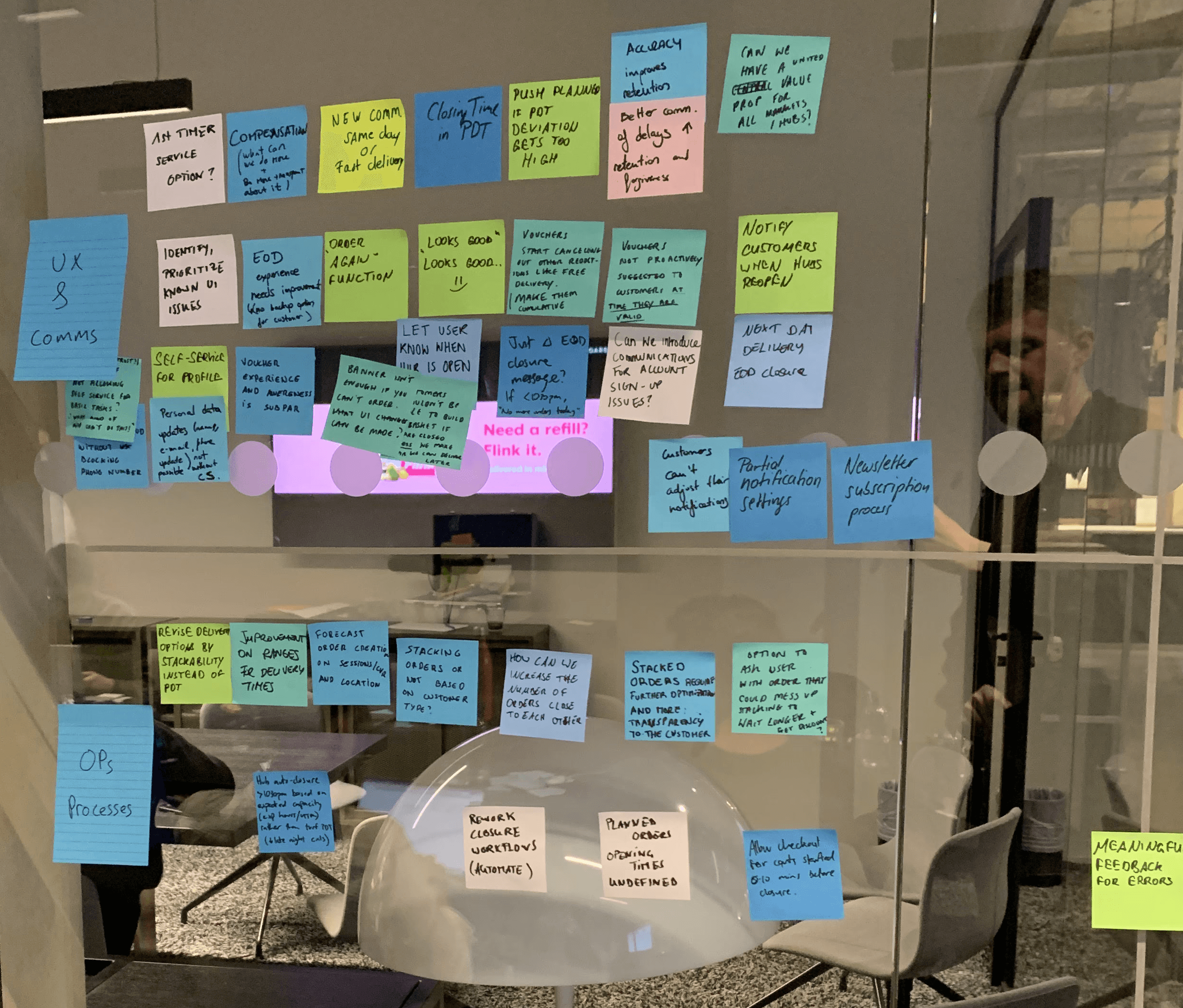
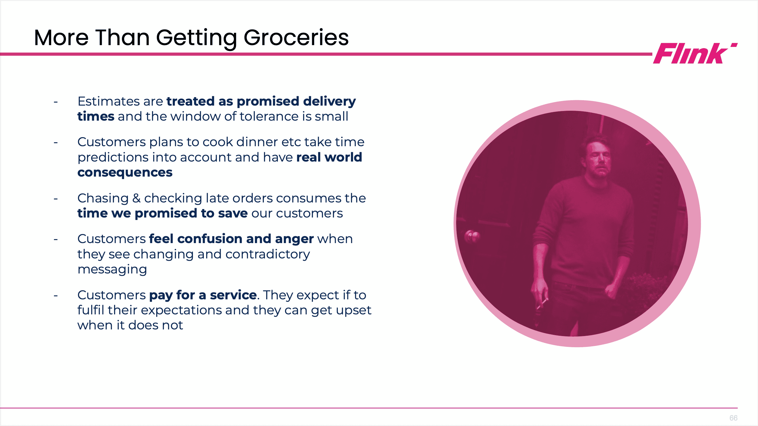
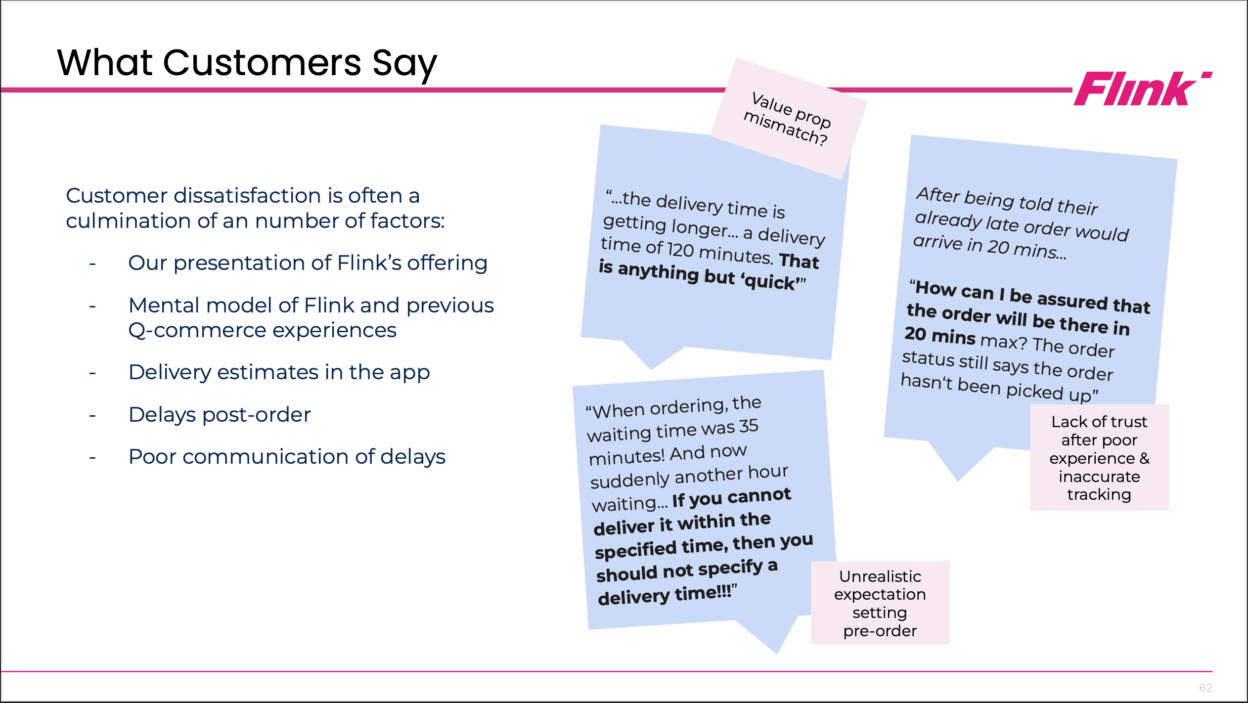
Day one, stakeholders shared what they knew about ordering, delivery and what drives reorders.
I mapped it into a customer journey, backed by Flink data, customer feedback and industry research.
Day two, I co-moderated ideation and prioritisation. Those insights became concrete bets — fed directly into the Ordering team's 2025 roadmap.


Refined insights
Findability, not accuracy. The tracking view was good enough. What failed was getting back to it and keeping it once found.
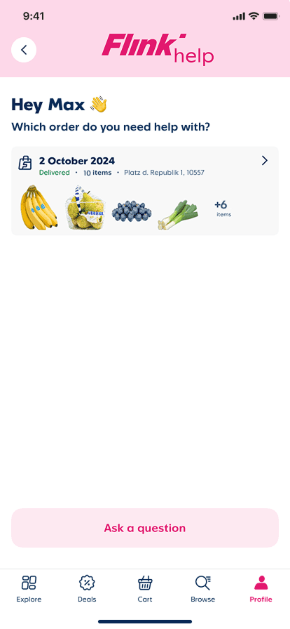
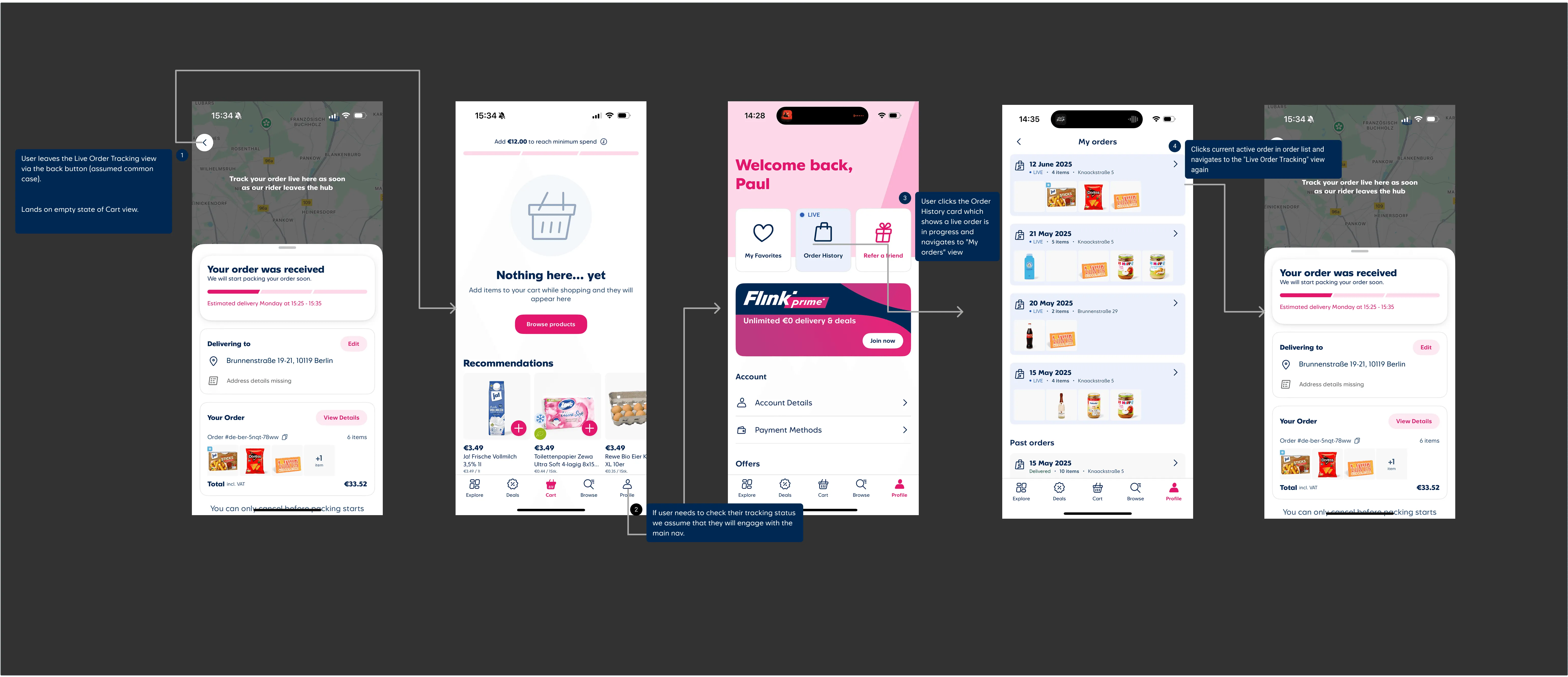
The return path was broken. Back navigation sent customers to the homepage, and getting to an order took five steps, sometimes landing them in an empty cart view.
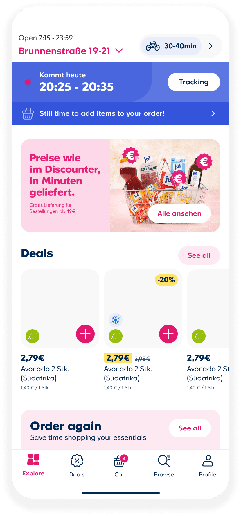
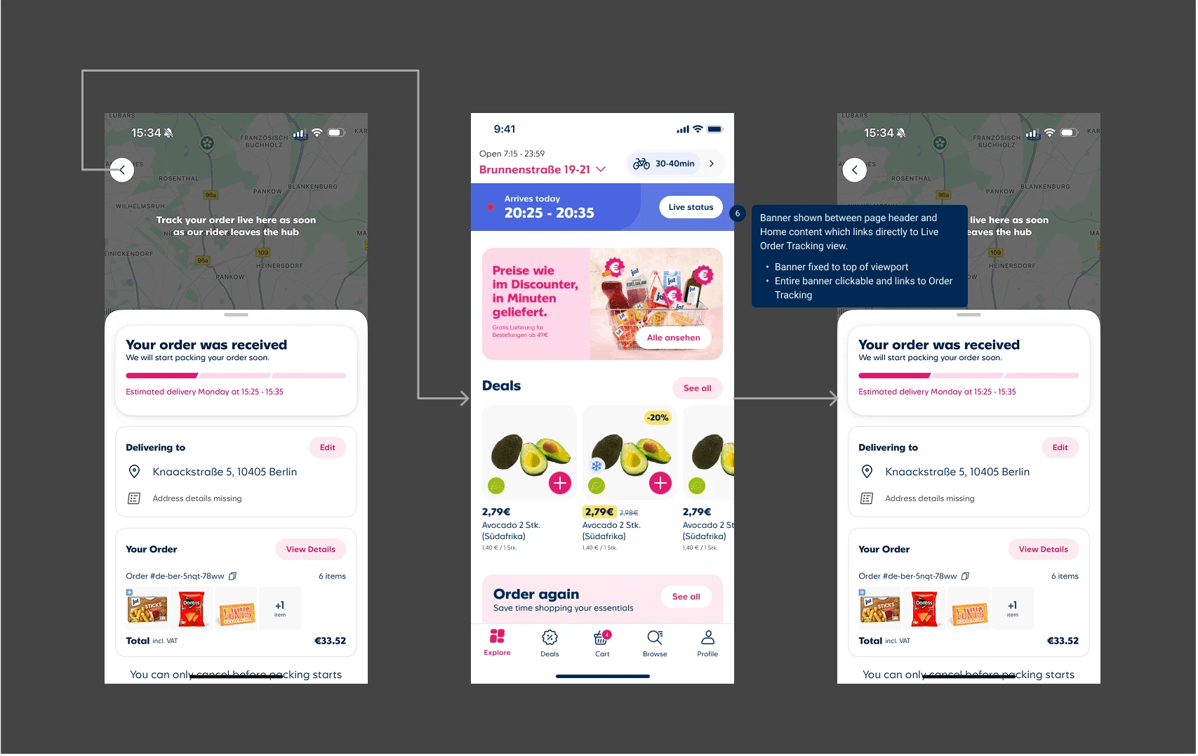
One entry point, three states. It had to hold active, add items and scheduled orders, in three languages, without reading as three components. Fixed beat floating, which clashed with too much of the existing app.
Hypotheses
Fix the return path, cut the contacts. If we fix the entry points and navigation logic, fewer customers will contact support to find out where their order is.
Make tracking somewhere to land. If tracking stays one tap away after customers leave and come back, they’ll stop hunting for it in Profile.
Shorter route, fewer dead ends. If we cut the steps back to an order, customers will stop ending up on the homepage or in an empty cart.

Clear Order Tracking & Editing
Entry Points
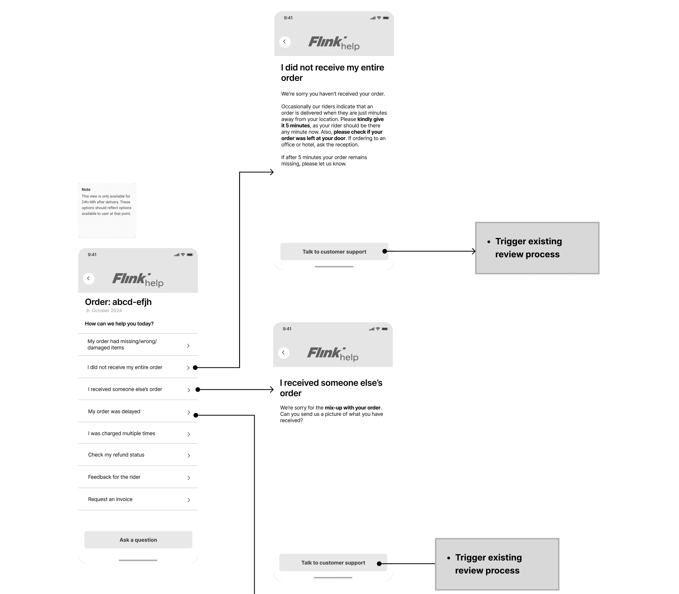
An early version used a floating element persistent across all views. It was dropped — too many conflicts with existing app elements and no clean way to resolve them within V1 scope. A simpler, fixed entry point delivered the same core job with less risk.
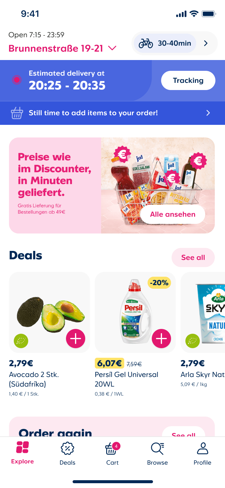
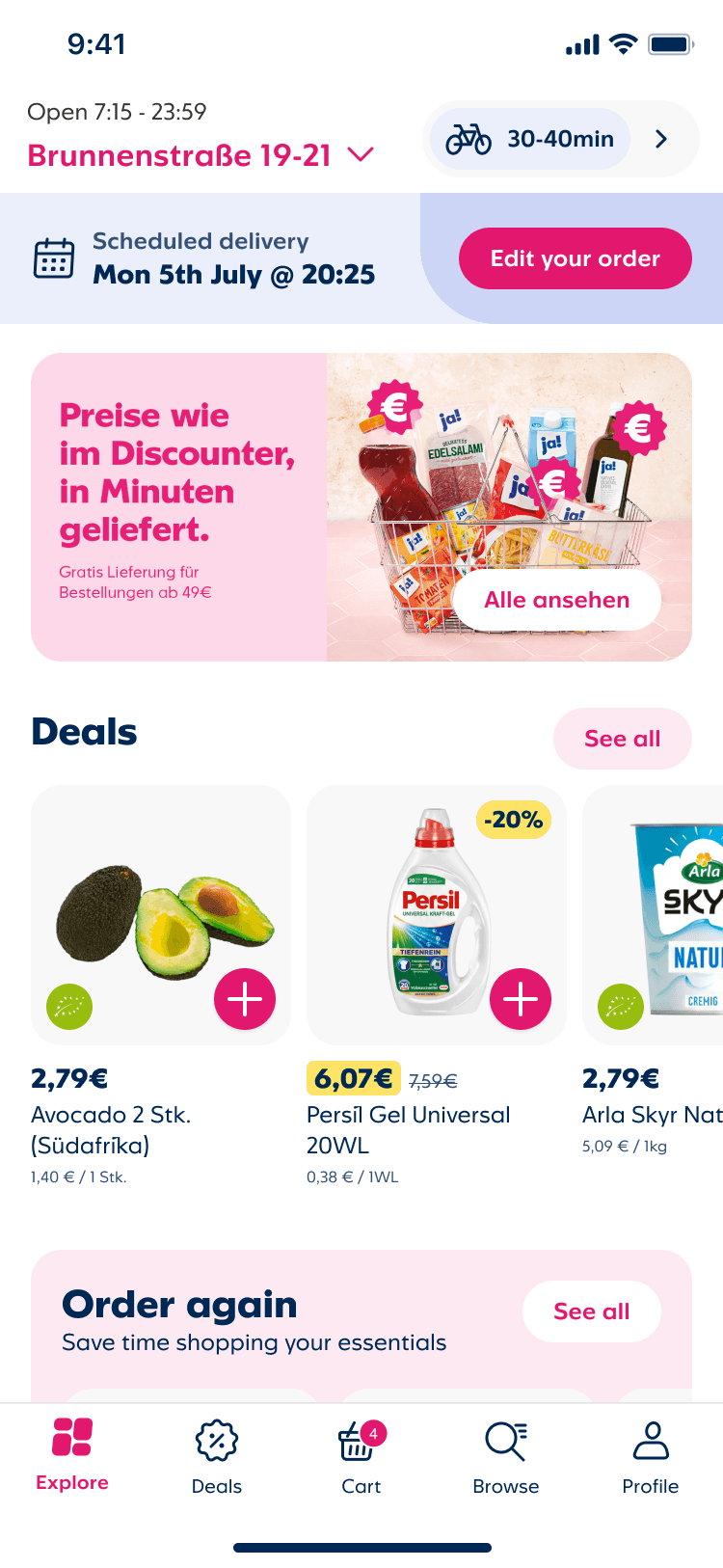



Modular Functions
The entry point needed to cover three distinct order states without feeling like three different components. Active order, add items, and scheduled delivery each required different information hierarchy — and all of it had to work concisely in German, Dutch, and English, where phrasing runs longer than English equivalents.
Visual exploration

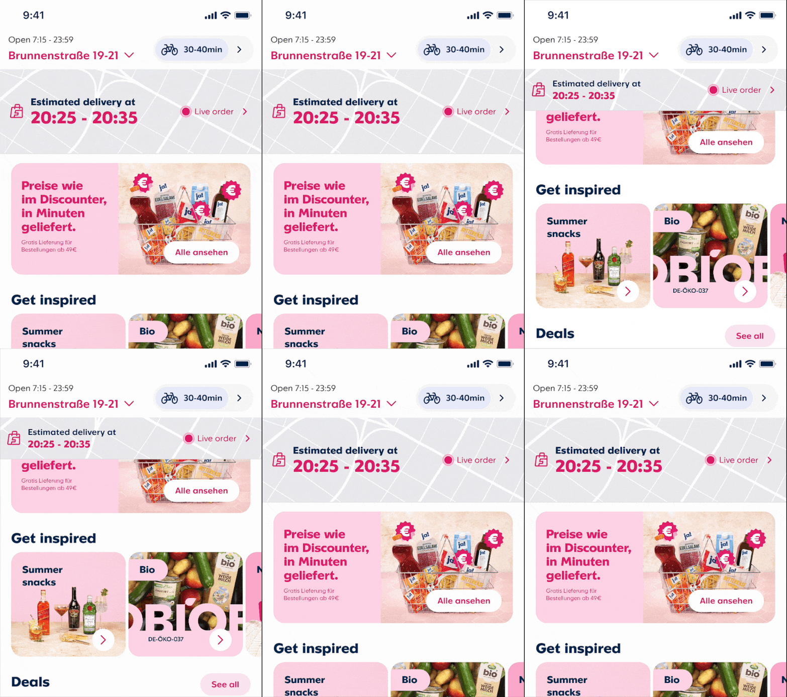
I experimented with animated state changes in the UI to change the prominence of the tracking element depending on the assumed intent.
In this case, an expanded tracking banner on load which then reduces in prominence as the customer scrolls to the standard shopping content.
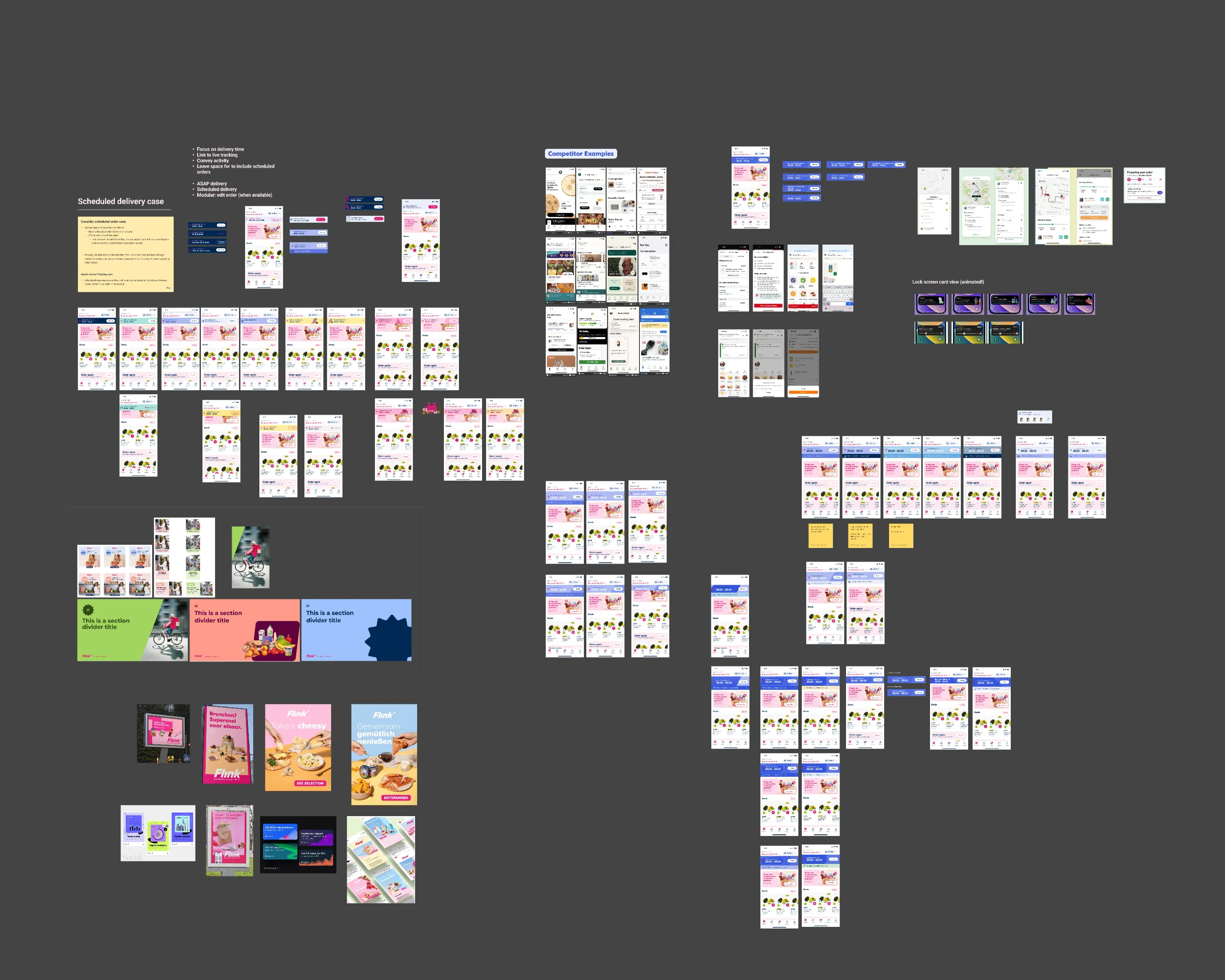
Figma exploration boards
Discarded concepts
Floating time tracker
The element was favoured by some stakeholders, but the interactions and overlaps with the shopping experience were too risky without more investigation. So, for a first version, it was ruled out.


Tracking in the nav
The nav is constant in the app, so it would provide a visible, fixed spot for users to access tracking information. But adding a new item to the existing five items proved visually problematic.
Removing one item based on order state (assuming Cart wasn't useful for active orders for example) was tried, but we didn't have to research and tracking bandwidth to weigh up the negatives.
Fixing Navigation Logic
Literal navigation that just reflected the technical setup of the app led to users ending landing in an empty cart view. So even with the new entry point banner customers got lost in the system.
5 steps down to 3
Matching the process to the logical path that incorporated a transition from pre-order to post-order experience.
Orignal
Updated
Next steps
Editing Live Orders
V1: Add items to a live order flow
Delayed payment capture started as a cost initiative — reducing refund costs — but it unlocked something more interesting on the product side.
If payment wasn't captured until packing, customers could add items to a live order. Forgetting something was a common cancellation driver, so solving it reduced drop-off and grew basket value at the same time.
The flow was intentionally light: Add items → a quick shopping view → streamlined checkout, attached to the existing order.
Outcomes
Cancellations fell 23%
once we gave customers clearer status cues and real order visibility. Customers stayed confident their order was on its way, instead of cancelling out of doubt.
Unblocked new scheduled orders work
by designing a scalable module that could accommodate upcoming functionality across teams.
15% CSAT lift
right after interacting with live order tracking. Real visibility into their order gave customers confidence, even before it arrived.
