


Less time managing the inbox. More time managing patient care.
The Setup
The Context
Klara sits at the centre of a practice's patient communication — a shared inbox where messages land and front-desk staff triage them.
As practices grew, so did the volume. Headcount didn't scale at the same pace.
What we observed:
Staff were spending time opening messages just to understand them before routing. Voicemails took longer to process than text. Common actions were buried one click too deep. At 200–400 messages/day per practice, these small frictions compounded.
Klara's target customer to grow: multi-site practices with 10+ locations. One inefficiency per location × multiple times daily = real effort cost.
Digging Deeper
Looking at support tickets, usage data, and talking to Customer Success and practice staff, a pattern showed up quickly:
Front-desk teams were doing too much work just to work out what a message was, before they could even respond. Messages arrived unassigned, voicemails slowed things down compared to text, and useful actions lived one click further away than they needed to.
So the inbox could do a better job of helping staff make decisions.
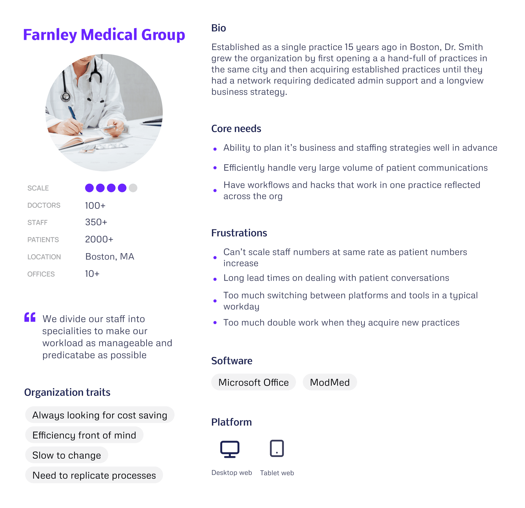
Practice Personas
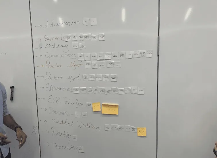
I used our discovery findings to produce a set of "Practice Personas", focussed on our target larger customers.
What this taught us
"Farnley Medical Group's" problems aren't feature gaps, they're scale mismatches. Every inefficiency compounds across 10 practices. So our priority became reducing repetition before adding capability.
Design decisions this drove
Templates — a good answer written once in one practice could roll out across the whole network. That's the only way efficiency scales at this size.
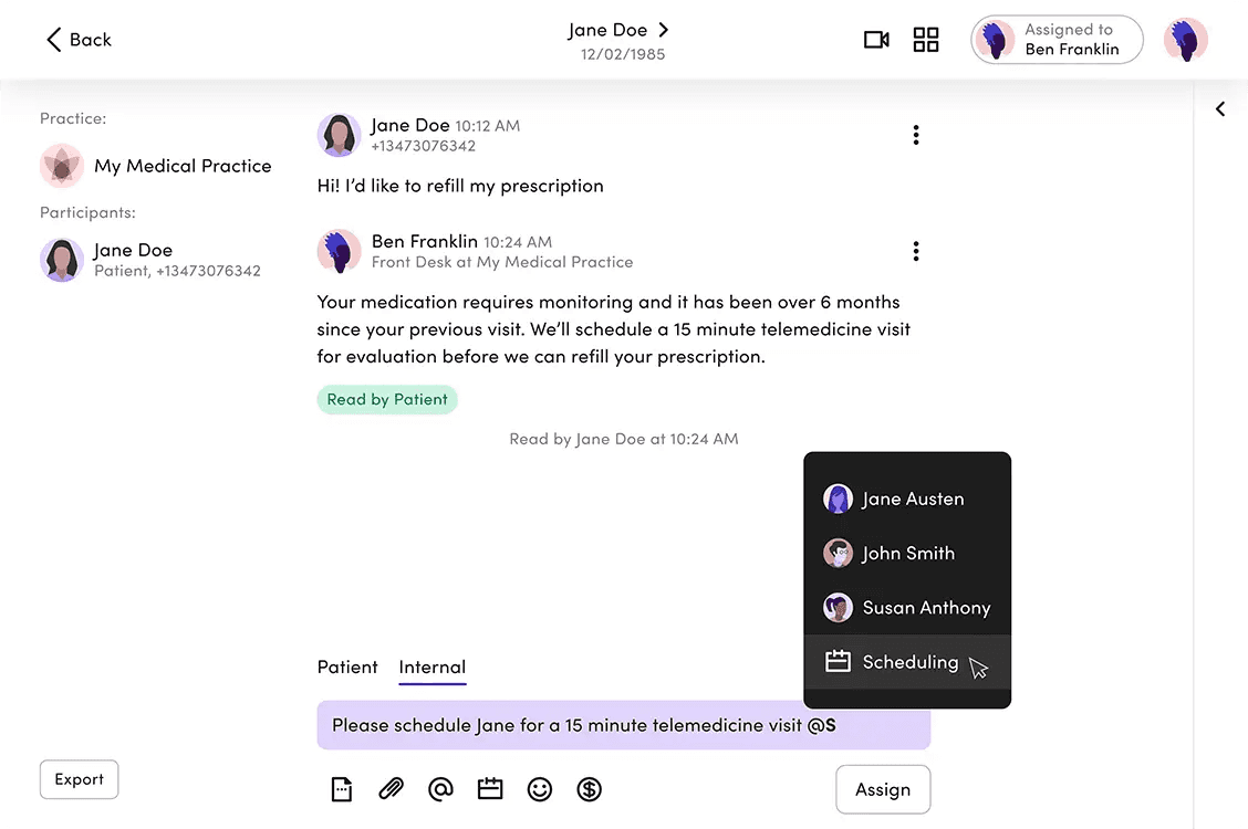
Triage — staff needed to see what required attention without opening threads. Quick Inbox Actions removed a step people were doing hundreds of times a day.
Onboarding — the Automations Builder was designed so a new practice could publish a working rule in around five minutes. Structured enough to feel safe, simple enough to actually get used.
Through rounds of discovery we were able to develop a picture of common workflow problems that, if we solve them, could have a big impact on our customer's working day…
Our Focus
Developing Our Ideas
With stakeholders aligned on the problem and engineers involved from the start, we could move into ideas with a shared sense of what was actually buildable.
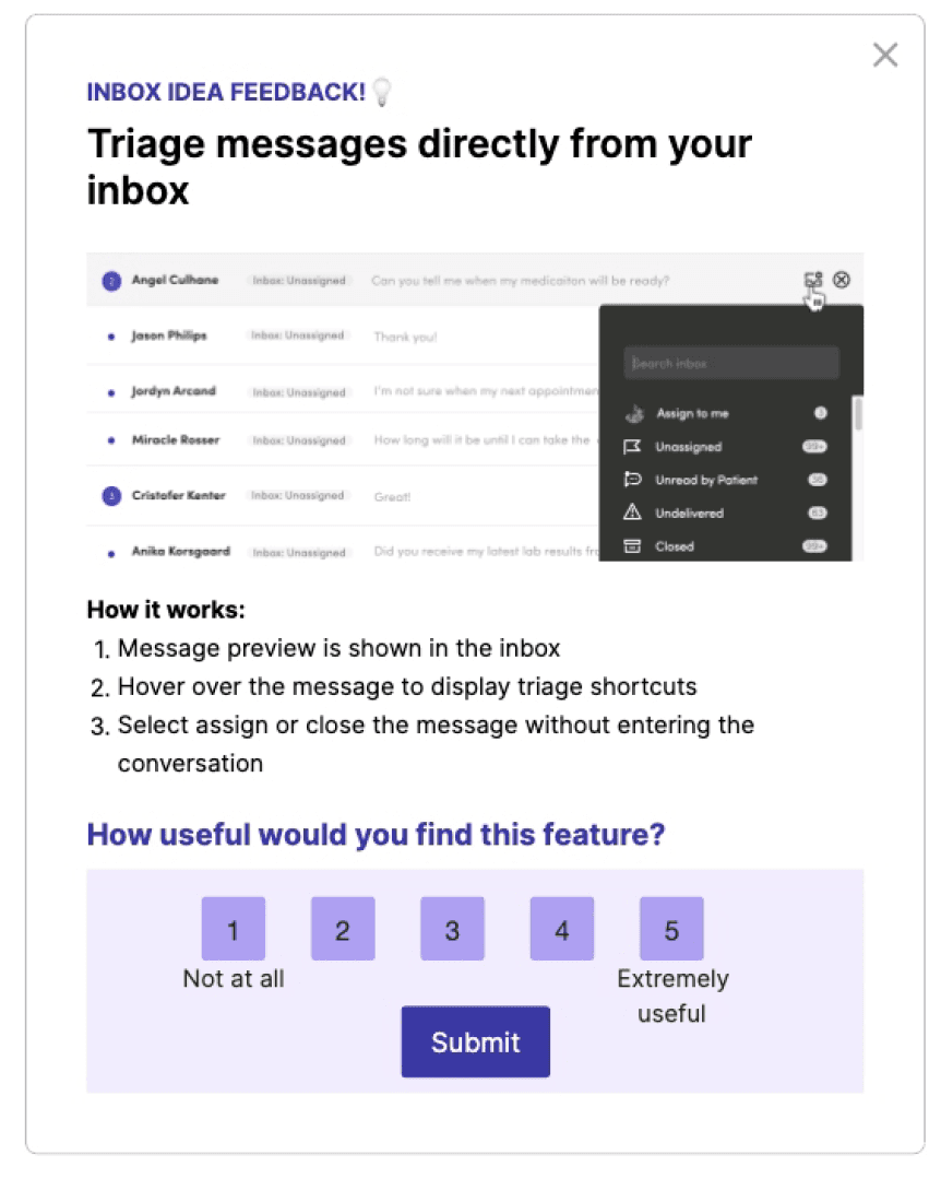
Gathering Regular Customer Feedback
Early concepts were taken to Customer Council sessions and targeted in-app surveys via Pendo to pressure-test ideas with the people actually doing the work.
Outcome: Bolder UI changes were well received in conversation — but prototype testing showed we needed to sequence them more gradually.
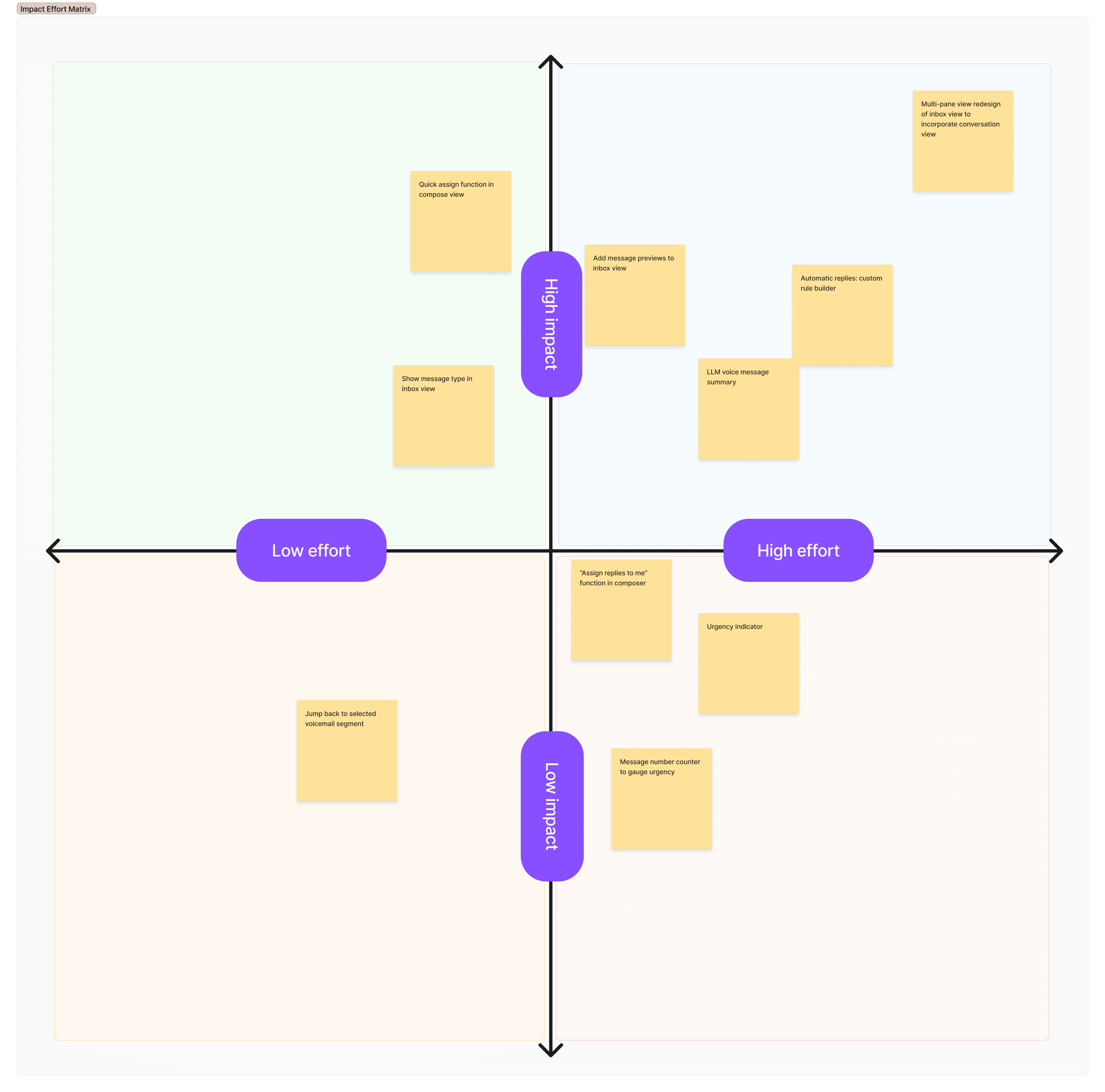
Deciding What To Optimise
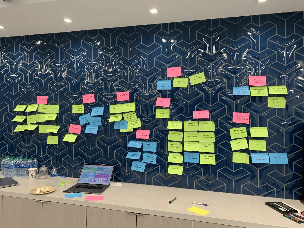
We ran an Impact/Effort workshop with the team to rank viable ideas and agree what to build in what order.
Outcome: Five key changes prioritised in stages — three smaller improvements shipped while the two larger ones were planned in parallel.
Mapping Scenarios & Logic
Primary use cases were mapped with users and engineers to establish what was technically possible — before any UI design was considered.
Outcome: A shared scenario map that set the technical foundations and kept design and engineering aligned throughout.

Explore Each Interaction
With dozens of potential touchpoints across the staff workflows, we treated them as a connected chain rather than individual UI problems.
Outcome: Consistent interactions across the system, with new elements unified into the design system rather than shipped as one-offs.
With a clear picture of the workflows we're solving, team and stakeholder alignment, and a progressive release schedule we could build our solutions…
Principles & Approach
Make the most common tasks take no more than 2–3 actions.
Earn trust before asking for it.
Design for the organisation, not just the individual.
Sequence change so it can be absorbed.
Constraint is a given — work with it, not around it.
Every new pattern goes into the system.
Results Snapshot
Key Workflow Efficiencies
Message Automations Builder
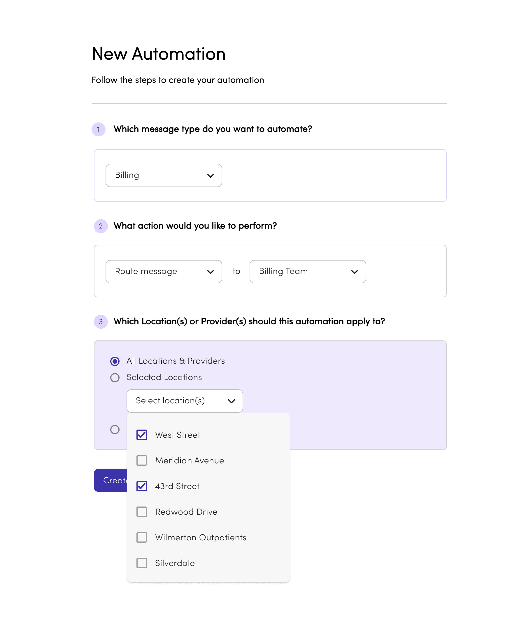
1.
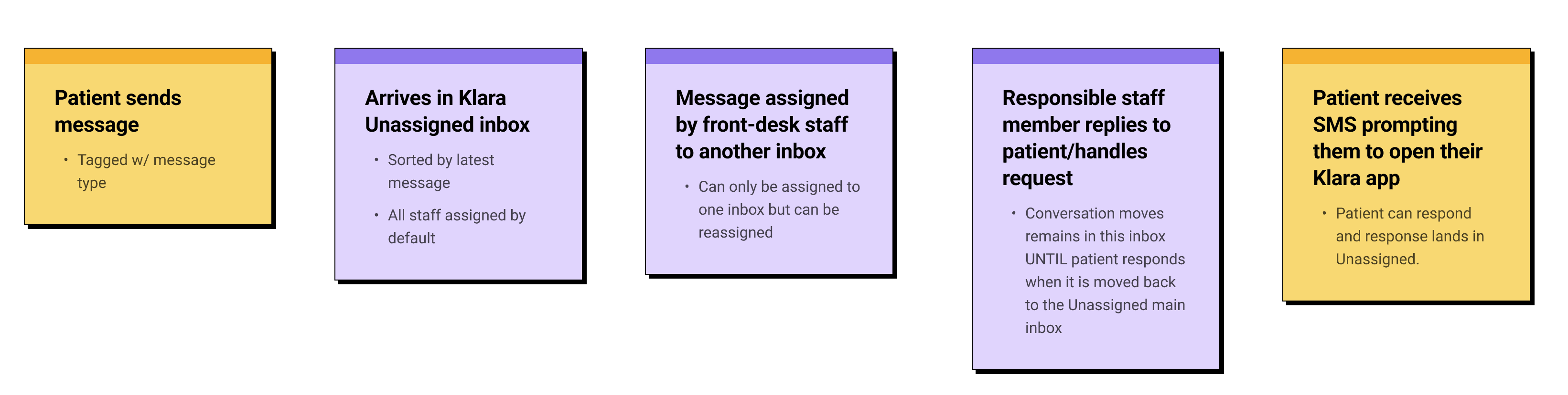
Messages are tagged when a patient starts a conversation. The tag persists for that session, but staff can reassign it if needed.

2.
Each rule triggers one of two actions: route the message to the right inbox, or send an auto-reply. Simple by design — the fewer the choices, the faster the setup.

3.
For multi-site practices, rules can apply across all locations or selected ones — so any efficiency saving scales without repeating the setup office by office.


First version of the automation management interface as designed to be a as direct of a representation of the rule setup as possible while still stripping away complexity for a non-tech-savvy user.
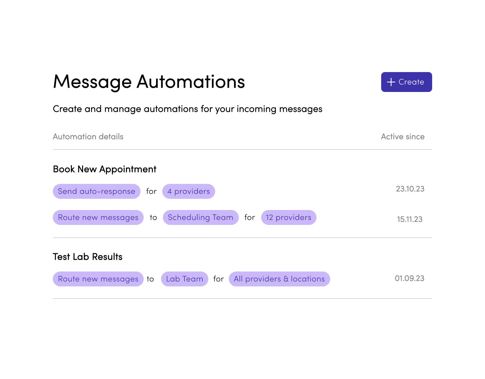
Rule rows are clickable and simply opened the filled rule builder, acting as an overview of the settings, along with "Delete" and "Duplicate" buttons as well as a "Disable rule" toggle. This was our V1 base for displaying rules and interacting with them which we would build out overtime as complexity increased and user feedback came in post pilot.
Outcome Snapshot
~5 min to publish a first rule.
Admins understood the logic - the friction was trusting it before going live. You could disable rules, but the next move was making outcomes visible so teams would rely on the system.
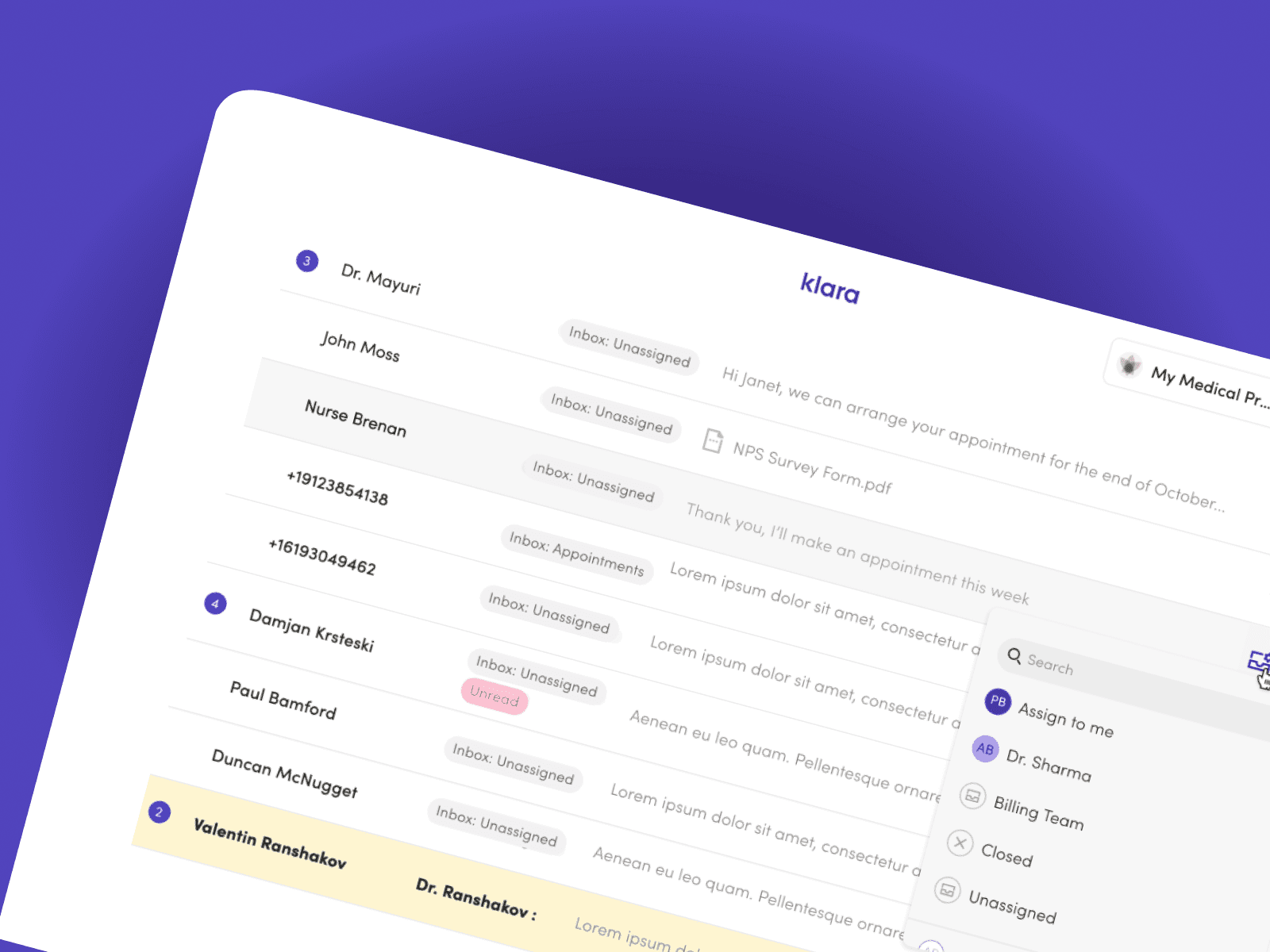
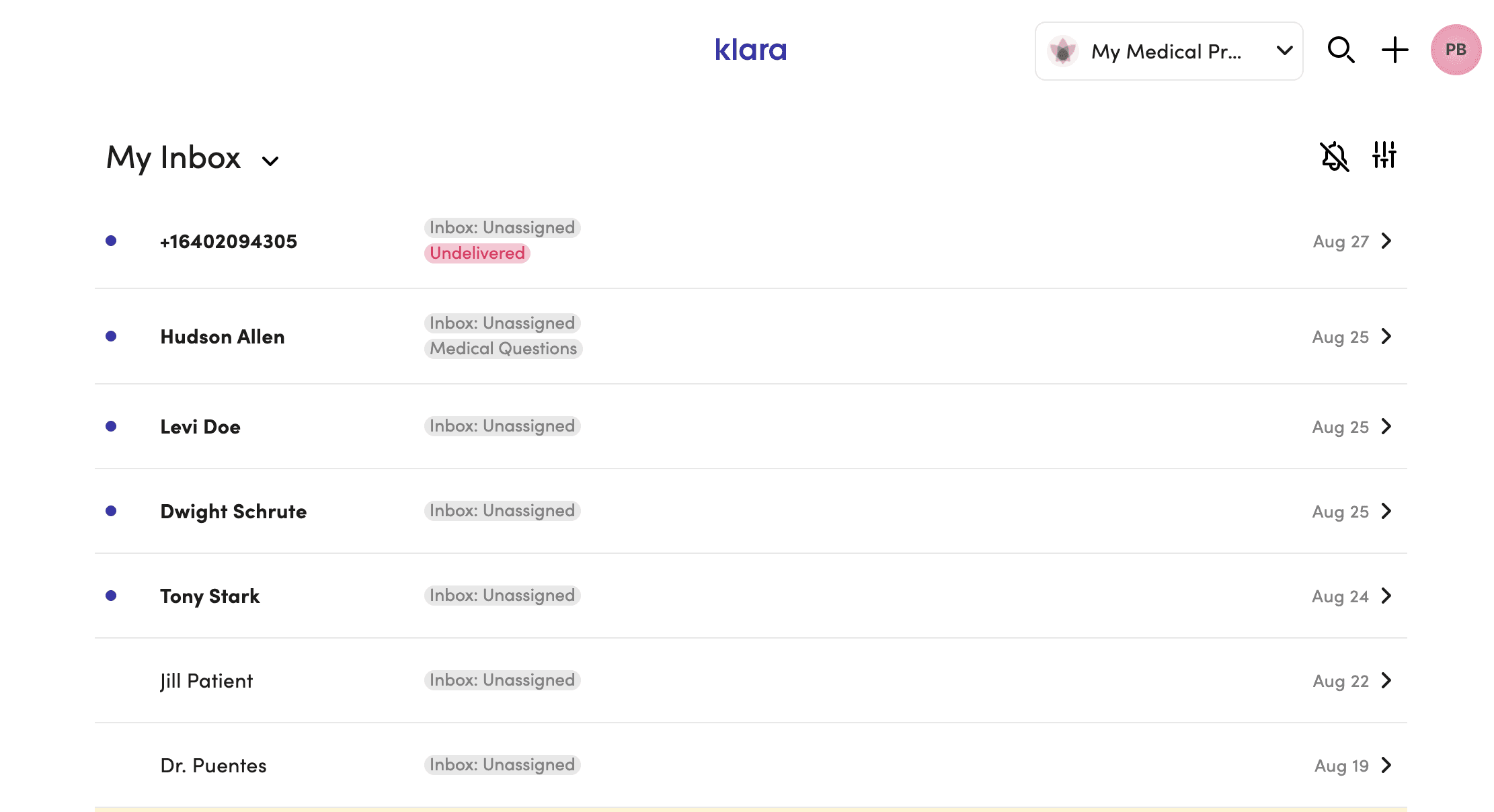
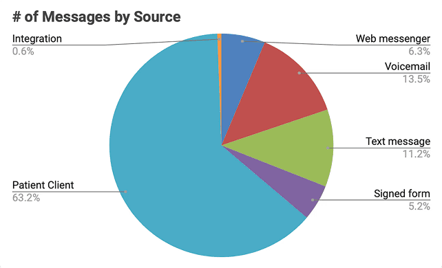
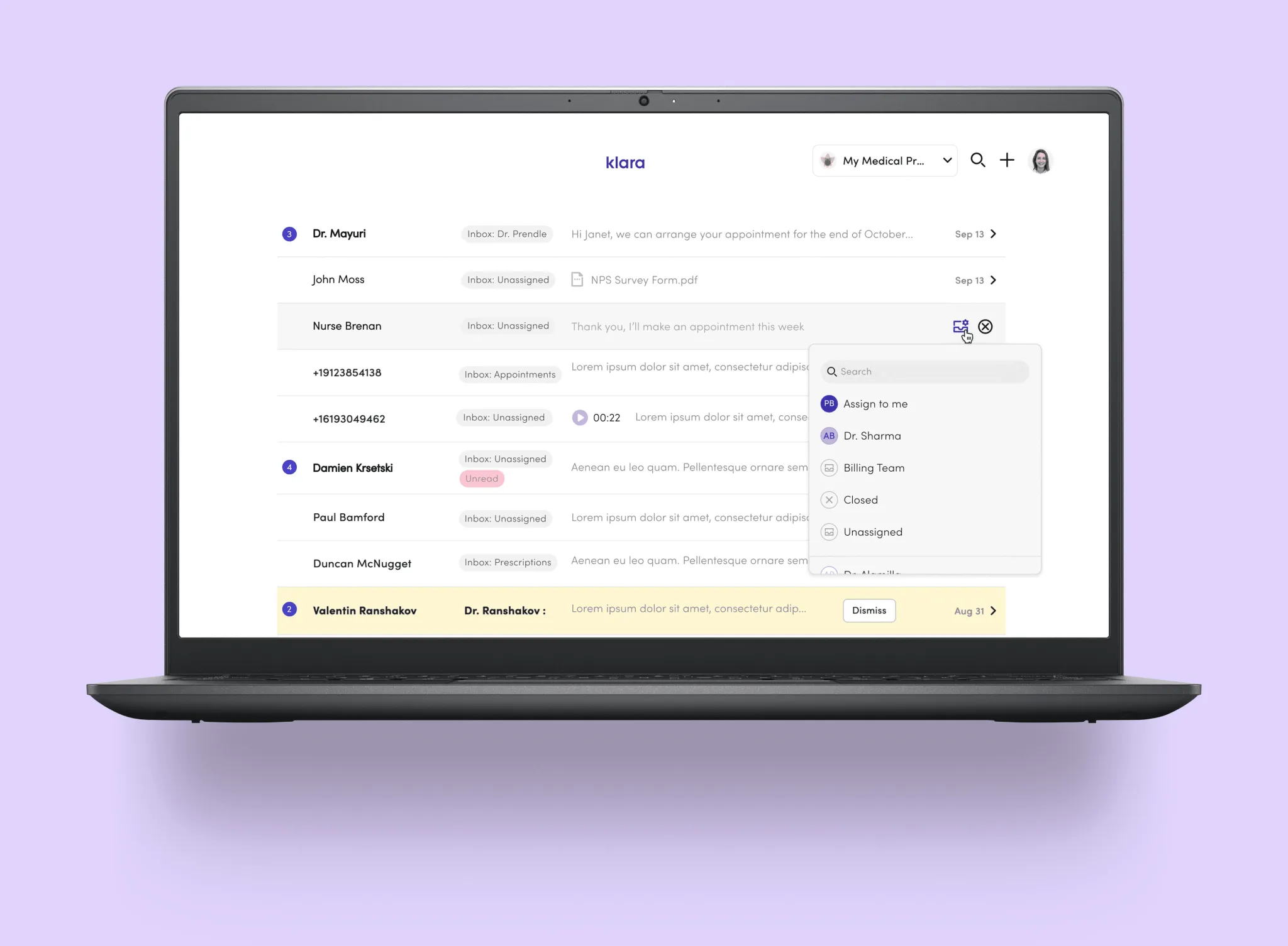
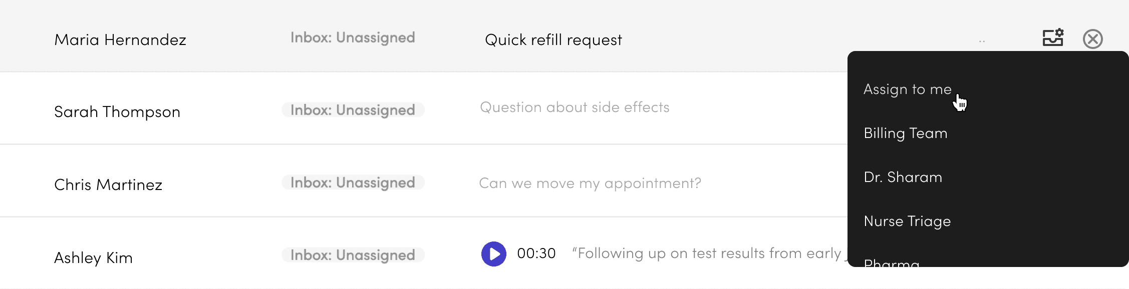
The original inbox gave staff three things: a name, an inbox tag, and a sent time. Not enough to act without opening the thread first.
The constraint: A fully customisable multi-pane layout (ideal solution) would have been 6–9 months of engineering. Sales commitments closing Q3 2023. We had 4 months.
Approach: Instead of rebuilding the entire layout, we optimised the preview itself. One interaction: hover state on the inbox row to select triage inbox directly.
Staff could make routing decisions from the list. No thread opening needed.
Result: 94% adoption in 30 days. Additive, didn't disrupt workflow.
The multi-pane concept stays on the horizon. Every decision we made here was designed as a stepping stone toward it.
Better context + Actions upfront
= Fast, accurate message triage

Four targeted changes to make triage faster:
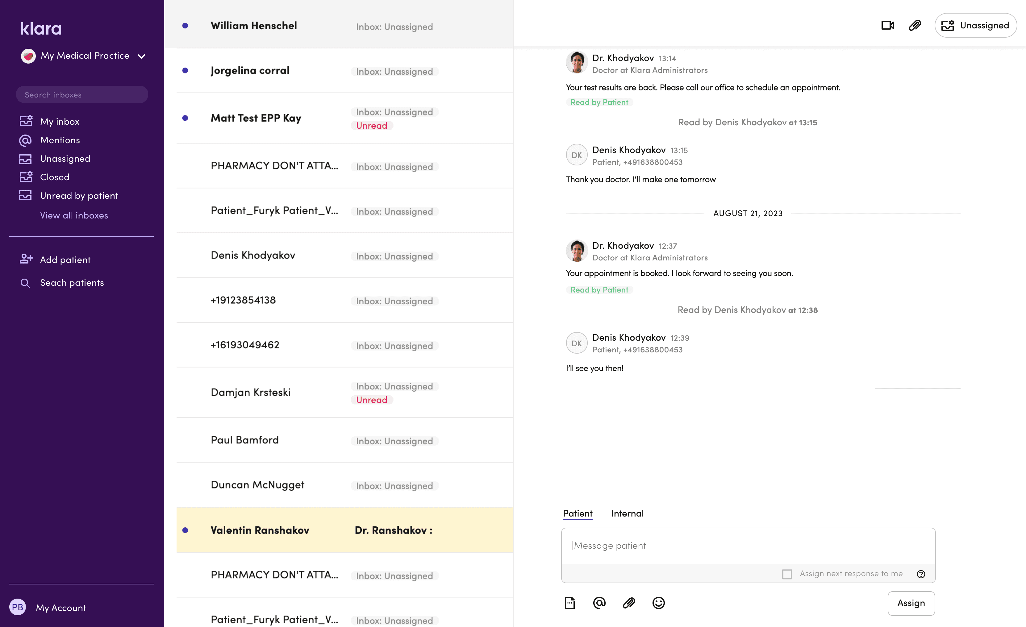
Staff avatar in the preview — shows when the last message was from staff, so you know a patient isn't still waiting.
Message counter — flags multiple unread messages as a quick urgency cue.
File indicator — surfaces attachments that might affect how a message gets triaged.
Voicemail preview widget — makes voicemails obvious in the list and playable without opening the thread.
Future Exploration
The multi-pane concept drew from tools staff already knew — email clients, Slack. We explored it at UI level and got strong feedback, but the technical lift and customer adoption risk were too high for the roadmap at the time. It stays on the horizon.

A 12-month collaboration with Google AI gave us direct access to LLM capabilities — and a chance to build features that genuinely changed how staff moved through their day.
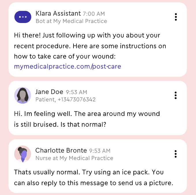
Voicemails cluttered the inbox. Listening to audio in a busy clinic made it tough to know what needed to be done. This created a real delay.
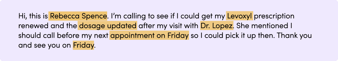
We turned audio into text and kept the original for verification. We also added a layer of meaning that included keywords, a short summary, and quick links to related actions. Every transcript became a searchable record and helped with future triage signals. Building trust was more challenging.
We tried using confidence scores, but staff ignored anything below 95%, so we decided to eliminate them. Our track record proved more helpful than percentages. Each interaction trained the model, and hesitation dropped from 67% to 34% over four weeks.
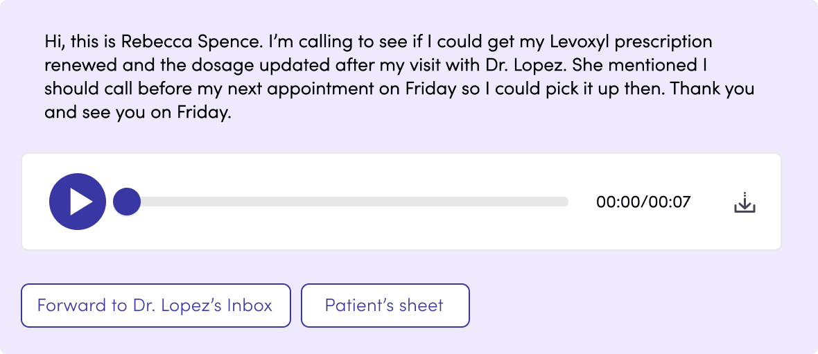

We trained the model to extract meaning from the transcript and surface it alongside the audio — reducing the time between receiving a voicemail and knowing what to do with it. Quick links to relevant patient records or actions like message forwarding.
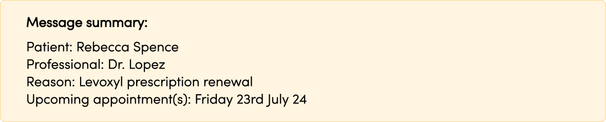
Highlighted keywords staff rely on for care decisions — medication names, patient details, usual doctor. A short summary block with the essentials, so staff could act without reading the full transcript.
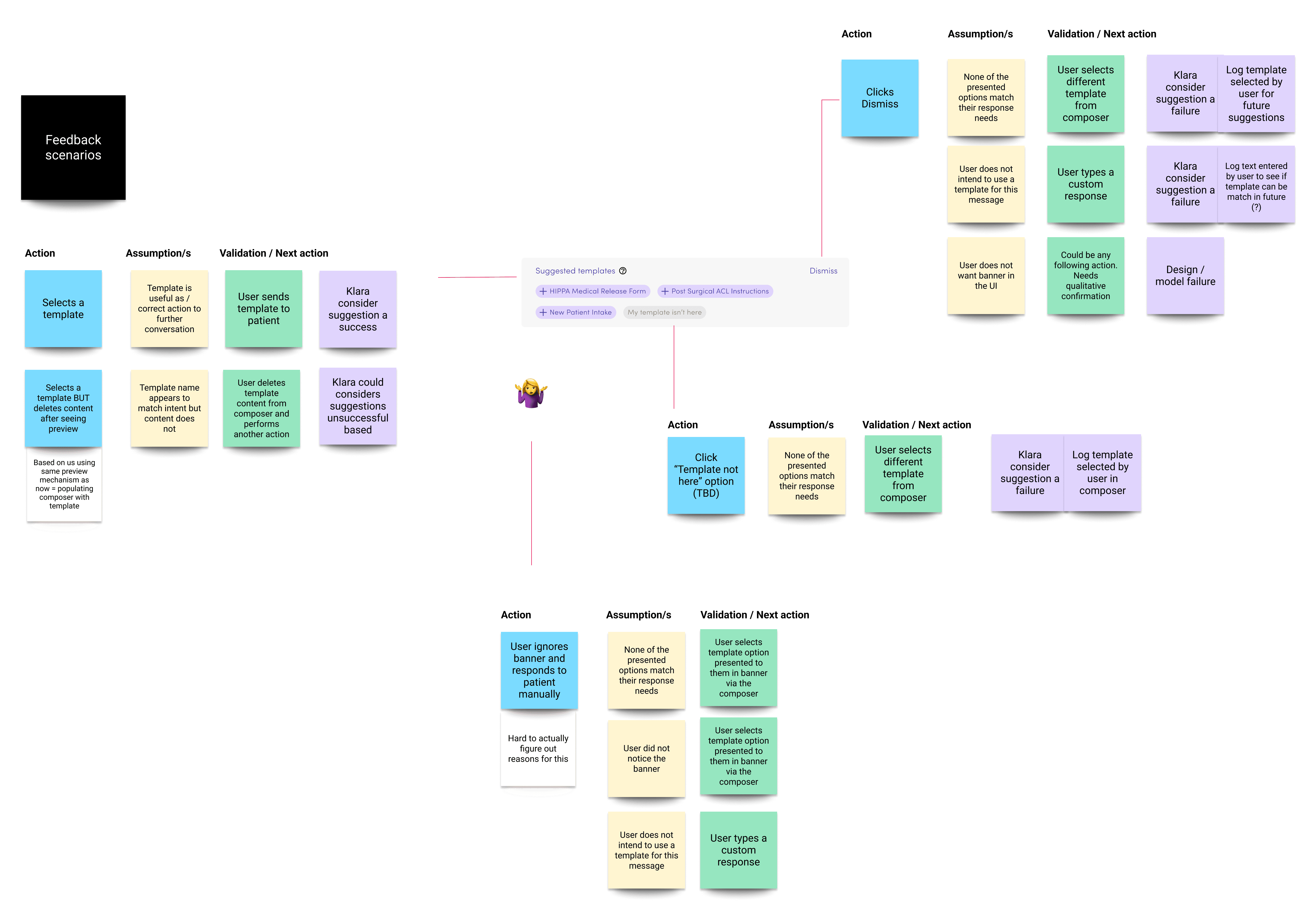
We used the LLM to read message threads and suggest relevant reply templates — reducing time staff spent searching.
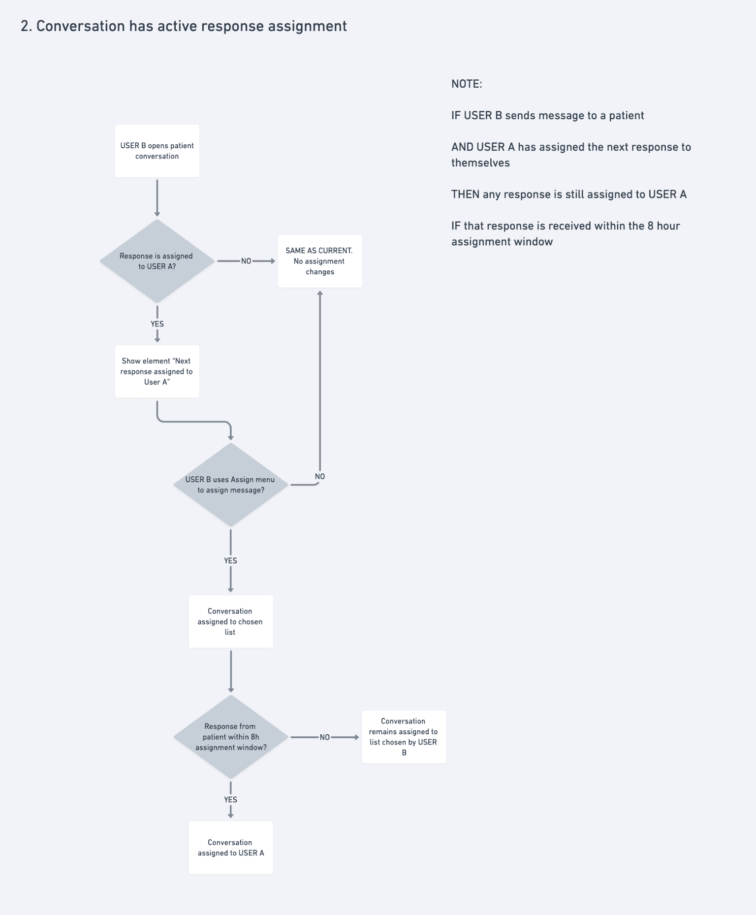
Suggestions could be accepted, dismissed, or edited. Every interaction trained the model. The logic map below shows how we designed for every outcome — ensuring each path either served the user or improved the system, without breaking trust.
Outcomes
Pilot Results
(8-week observation, n=23 practices)
Front-desk teams handling 200–400 messages/day reported:
3-person team: ~9 hours/month freed up
5-person team: ~15 hours/month freed up
Multi-site (8-12 locations, avg 3-person teams): ~45 hours/month across network
What Changed
Quick Inbox Actions:
Hover state to select triage inbox from preview
Eliminated unnecessary inbox-to-thread context switches
Message Automations:
Prescriptions, rescheduling, standard inquiries handled by rule
Limited to patterns safe to automate
LLM Features:
after staged rollout
Staff read transcripts instead of listening in busy office
Searchable record enables future insight extraction (medication mentions, urgency cues, triage signals)
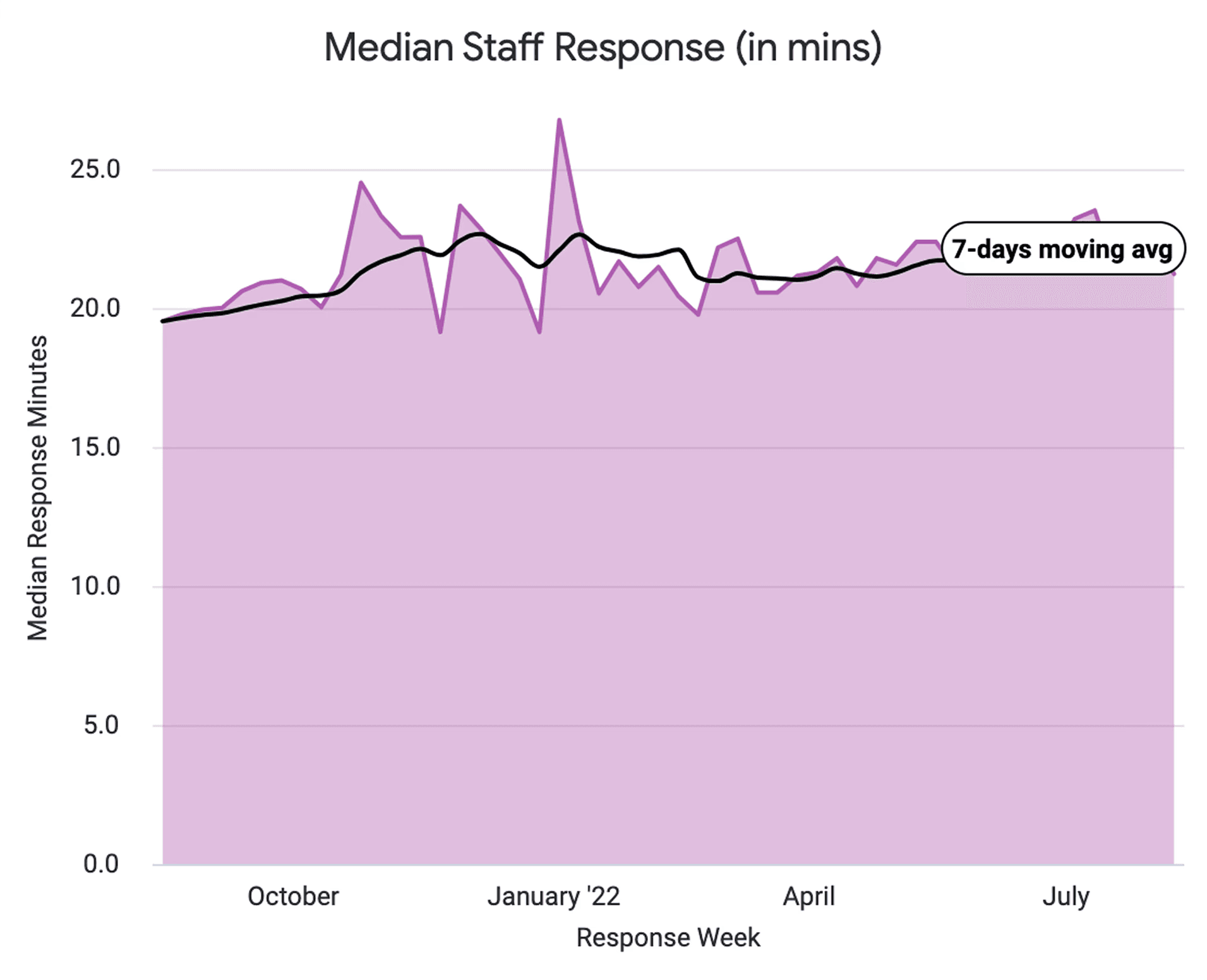
Measured over 2022–2024 via pilot analytics and support ticket analysis.