Quandoo
Project Overview
Working across a number of B2B products and workflows focussed on how restaurants manage their table inventory and schedules.
- Improving how a restaurant's schedule is shown in the B2B web app
- New concepts for setting and amending times the restaurant will take bookings
- Add new functionality to set recurring reservations
- Joined core group translating business goals into OKRs and roadmaps for the product teams
Helping restaurants manage their schedule
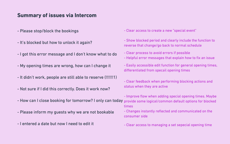
Restaurants had problems temporarily amending the times that they accept bookings from Quandoo.
This was raised by the customer care team after they were spending large amounts of their time manually making these changes for restaurants.
So we talked to members of the customer care team and from there gathered together all of the data we could from Intercom, the tool most used for communication with restaurants.
This showed a few clear patterns for the help requests.
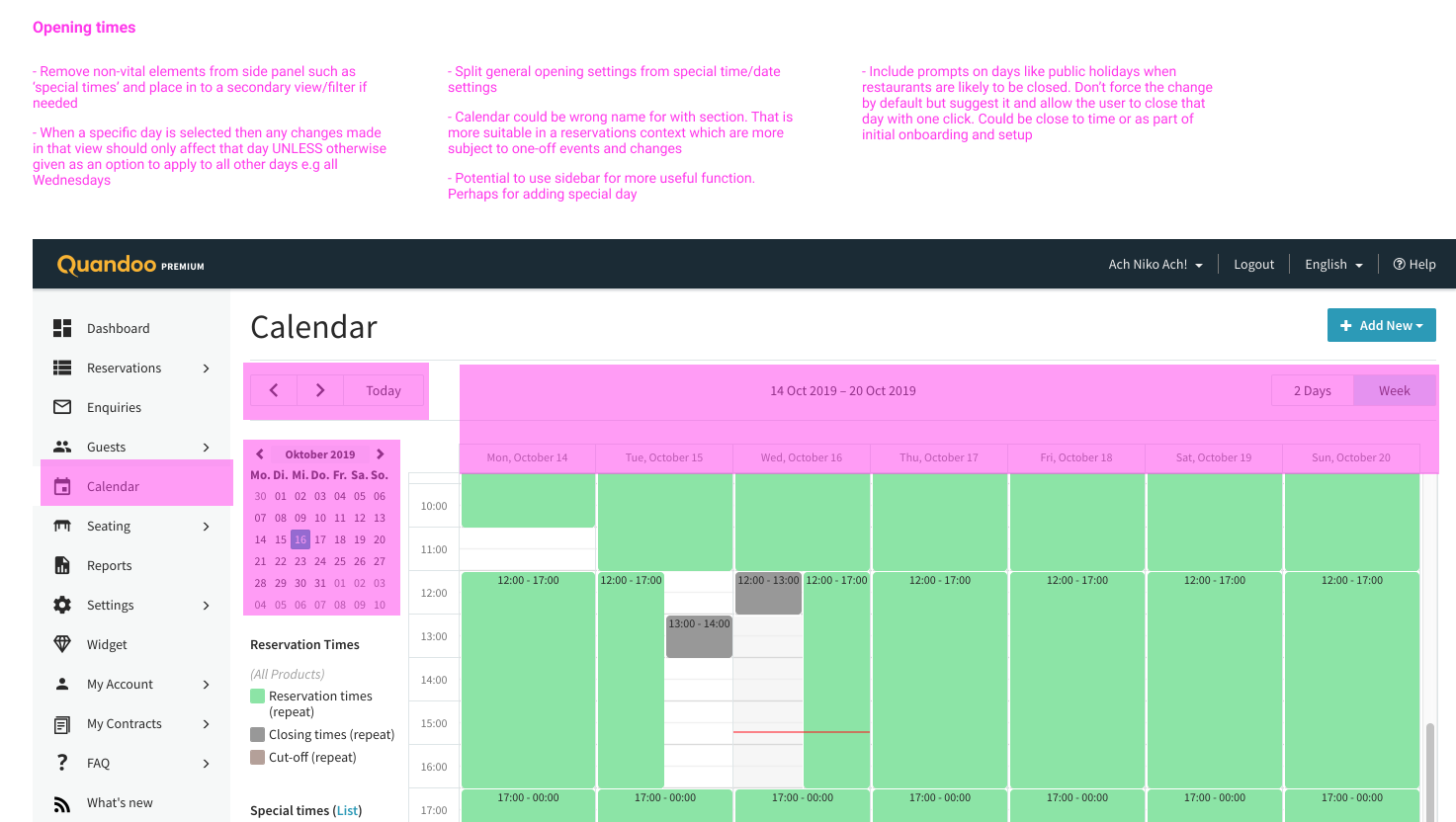
Analysis of Existing Experience
I first did an audit of the current solution with the help of the team to try and map the feedback we were getting to the product to identify potential spots where the problems. Problems included:
- The calendar is visually busy with a lot of repetition and little useful, actionable information
- No clear overview of active and upcoming booking changes
- Where a restaurant would click to amend booking times is not clear
- No access to help and other actions related to managing booking schedules
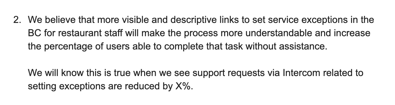
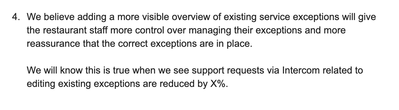
Our Hypotheses
When we had a better idea of the current problems with the current section I began the process of writing hypotheses and assumptions with the team so we could make some bets on what would improve the product experience and how we might measure our success or failure to do so.
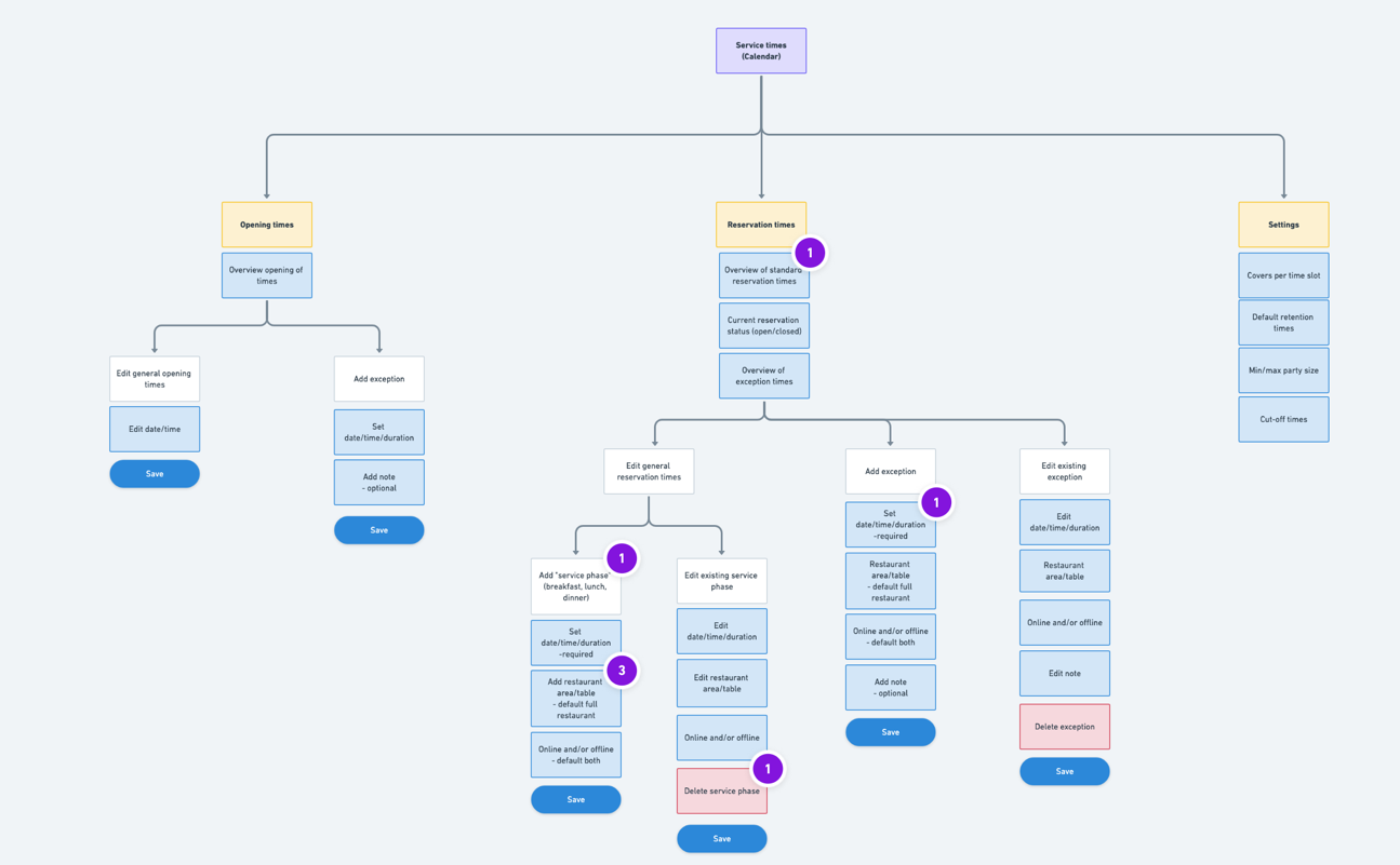
Mapping the Solution
Next, I began mapping the use cases we'd identified out as a team into a structure that could be applied as the basis of our restructured section in the Business Center.
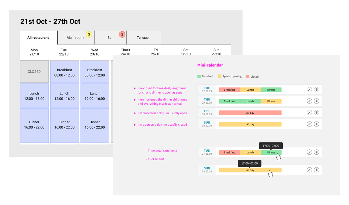
Design Exploration
Once we'd mapped out the structure I began to explore some approaches for making a more usable section with wireframes. This included various approaches from a fully an improved interactive calendar to replace the existing version to taking the calendar out completely and trying a minimal, less visual approach.
This process went through various iterations and covered several related elements in that section.
The Results
As we worked on the project we realised a phased approach was the only way to get to where we needed to be. So with this in mind, our first step was to address the immediate problems outlined in our hypotheses while not making huge changes to the existing calendar model and without removing features and functions restaurants had got used to over the years and which would need a large effort from a development point of view.
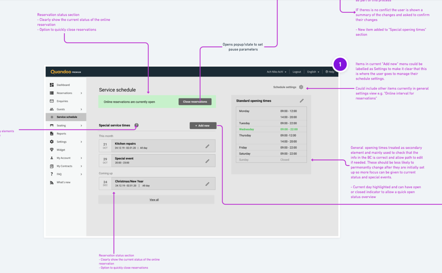
So with this in mind we made several changes while leaving the basic structure in place with a view to phasing out the old calendar when we had evidence our changes were working:
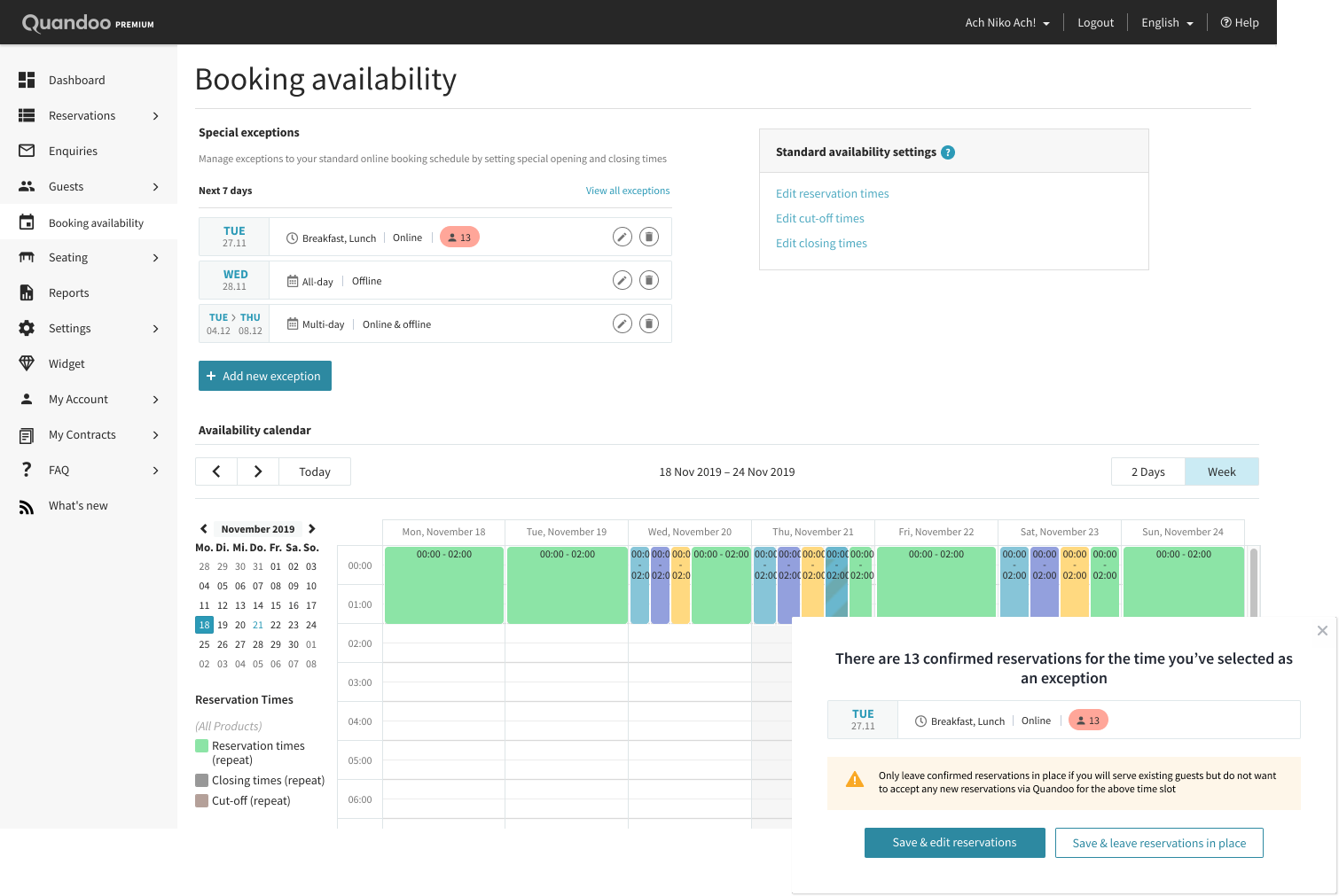
- Generally improve naming, text, and terminology on the page. For example, renaming the entire section from the ambiguous "Calendar" to "Booking Availability"
- Increase visibility of the button set amended opening times
- Adding a series of pop-up states which aim to warn restaurants about potential problems being created when making amends. These were the first steps in trying to have a more guided experience where errors were harder to make and easier to address.
- Adding an overview list for upcoming schedule changes
- Adding a help and similar functions section on the right so restaurants can navigate and find info before contacting the customer support team