GetYourGuide
Project Overview
I worked on various features and improvements over two engagements at GetYourGuide from the way they communicate with customers who have scheduled an activity to better ways of displaying and navigating things to do in a location. These included:
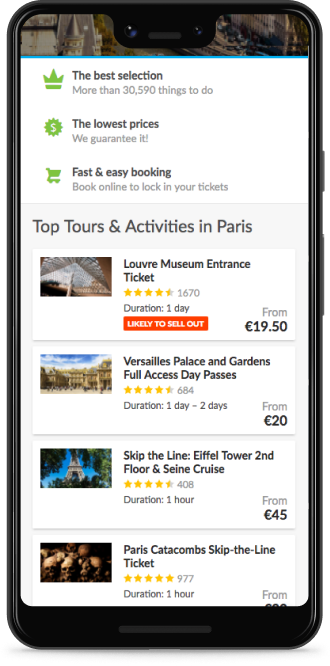
- Increasing visibility of what activities are available in a location
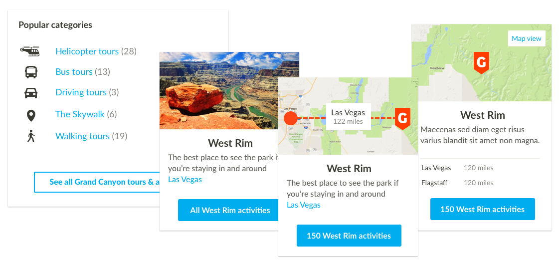
- Solve the problem of multiple activities at a large points-of-interest with multiple entrance points like The Grand Canyon
- "My Trip" concept for giving customers easy access to their booking and offering suggestions to add to their schedule
- Improving the experience for users post-booking so they receive all the info they need to carry out their activity
Increasing visibility of categories
Looking at the site analytics we saw the bounce rate from the activity listing page was high and that the first few visible results on those pages where getting an unevenly large proportion of click which were not leading to sales. The team came together and we formulated and settled on testing the following hypotheses:
- Aside from the search function and featured cities, sights, and activities, there was no real navigation structure present on the site. If we add ways to move through the site we will see more traffic from browsing
- The listing page filter element was visually very weak and the categories displayed there were not compelling. Bringing its functions to the fore at points when users need it will encourage wider engagement with the site and hopefully lead to more sales
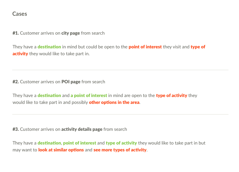
Cases & Structure
Firstly the team mapped the different cases that could occur when a user makes a booking. This would allow us to supply the correct messaging and content to users to and define what would be in the emails. This identified 3 possible states:
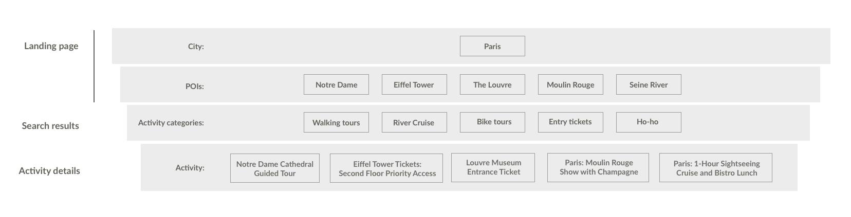
Bringing out the categories
We decided that the first step to address the lack of browsing and exploration as to increase the visibility of the available activities which we hoped would simply increase the awareness of the breadth of GetYourGuide's offering and let users access those activities within a couple of clicks.
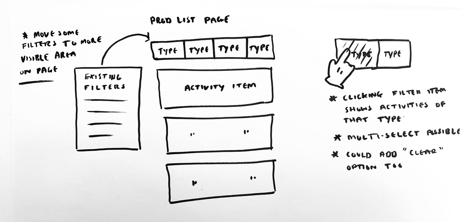
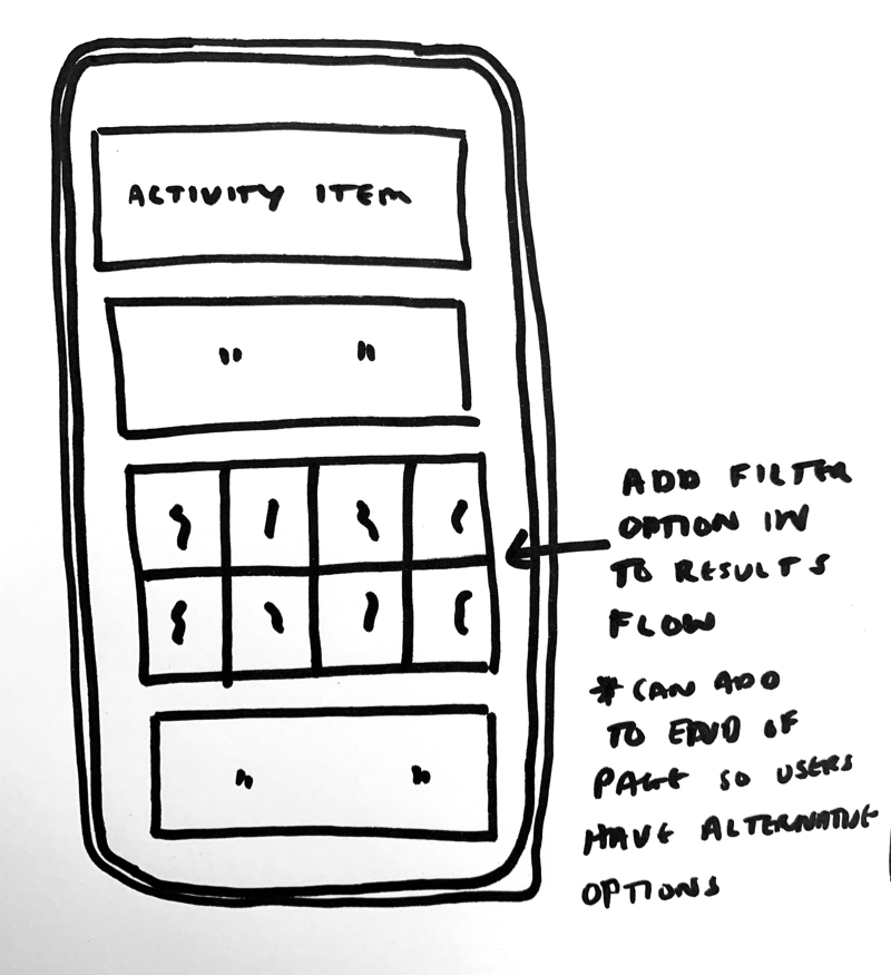
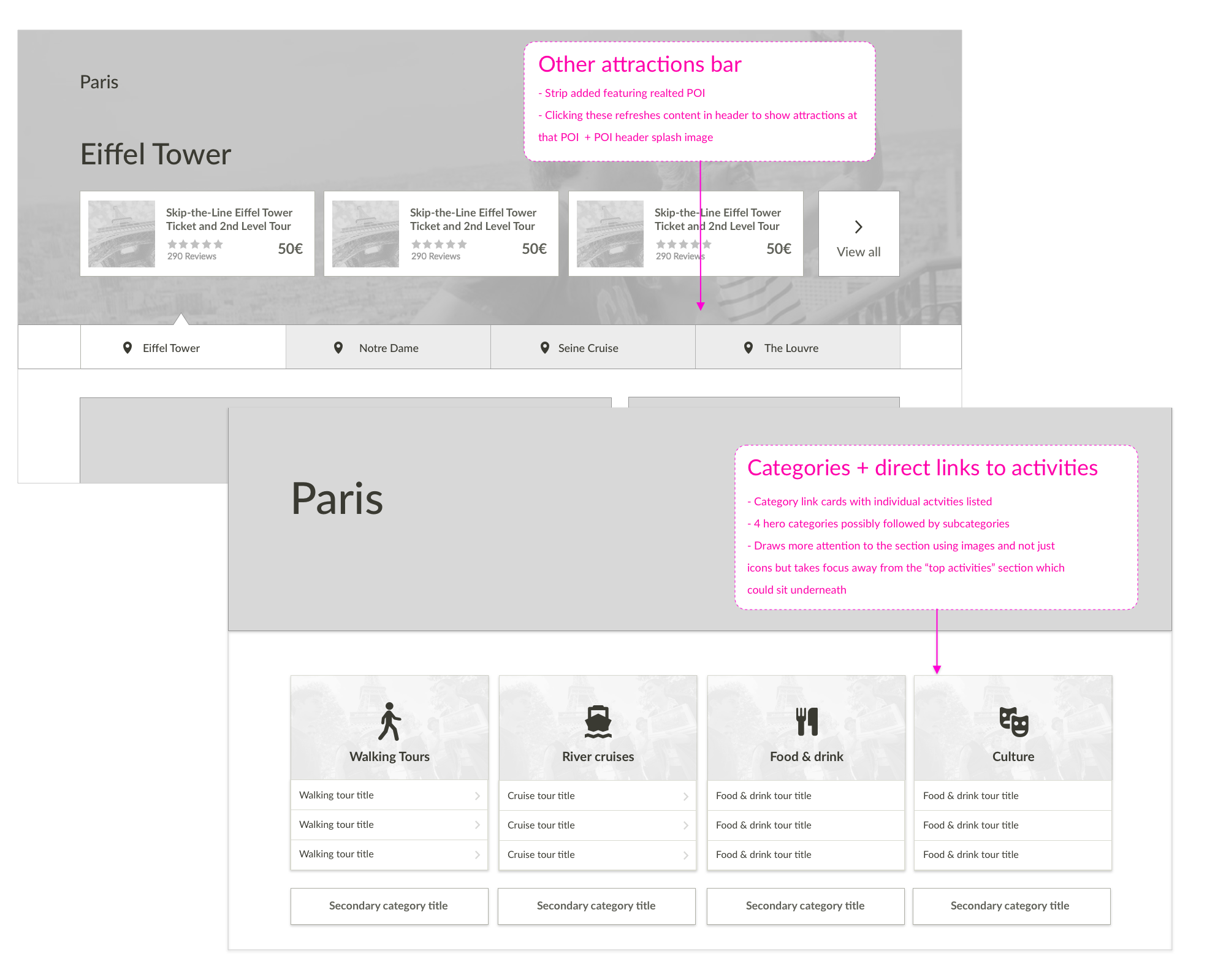
Wireframe concepts
With the basic idea sketched, presented, and agreed upon I moved on to creating some concepts for better presenting our categories and types of activities across the site. These ranged from some standard navbar elements to bringing in a card-type UI on to feature pages and injecting aspects of that pattern strategically into search results.
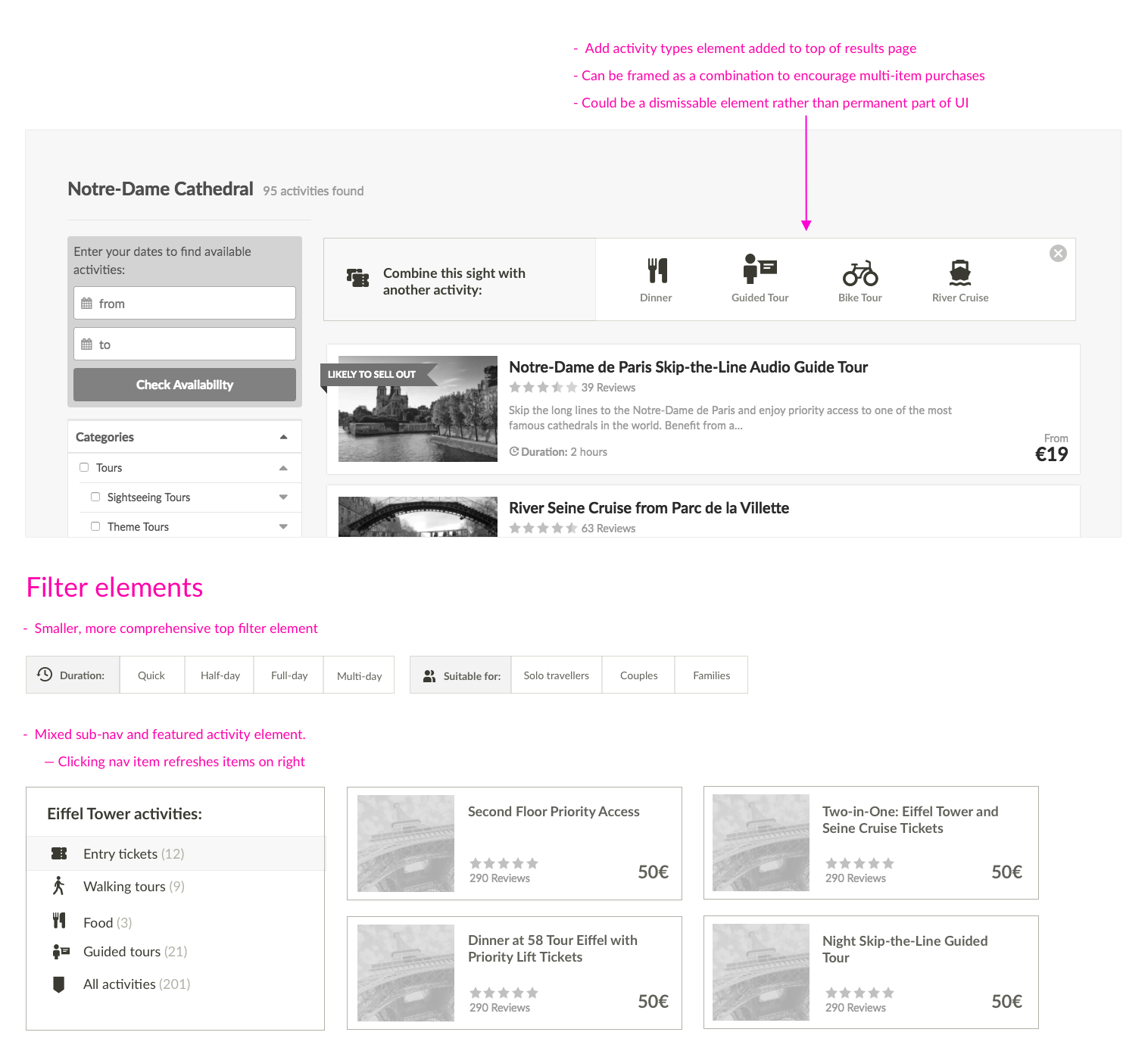
Designs for first version
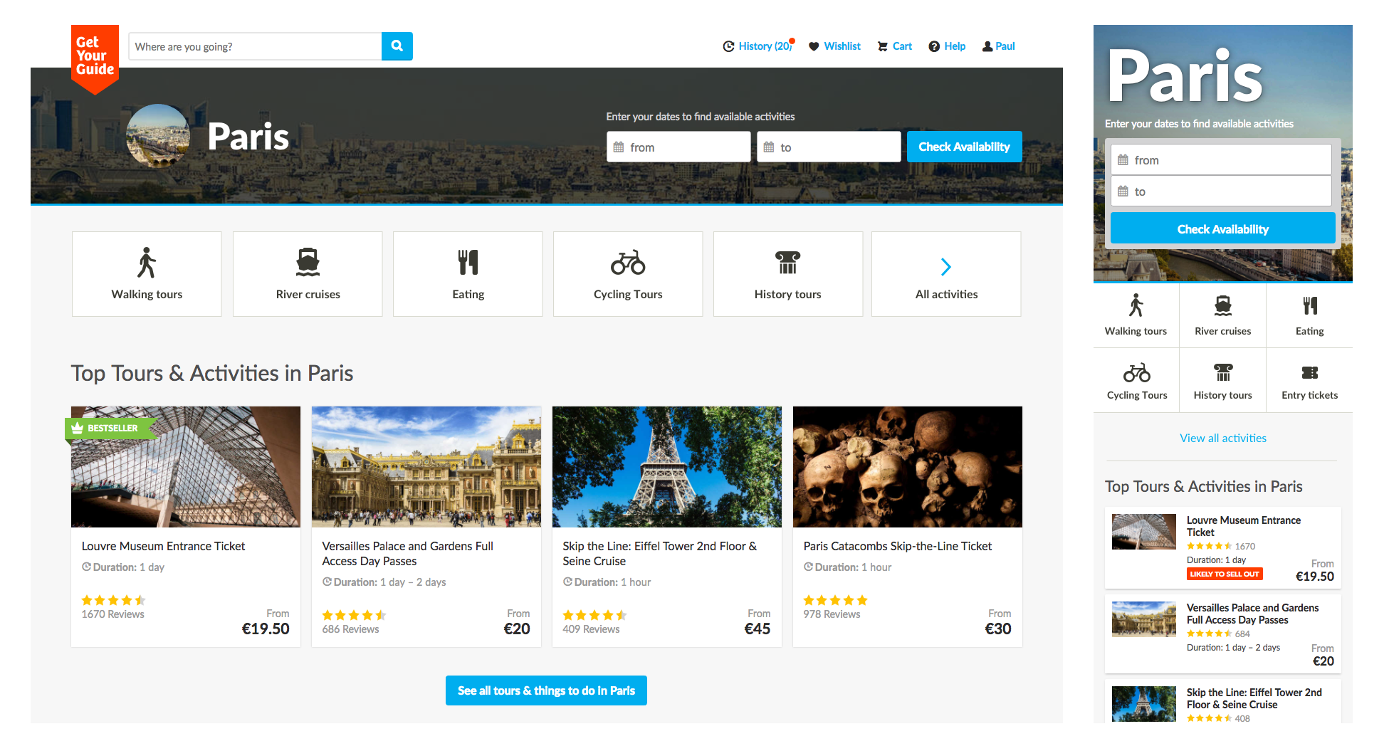
With a set of wireframe concepts and cases complete I put together the designs for the first version of a filter/navigation element as well as a set of concepts for additions in the future. As we wanted to build something quickly the first addition was a simple navbar with icons which would be used on city point-of-interest pages. This had little development overhead and fit with the current site structure.
The Results
The first version consisting of a new nav bar on the high-traffic city and point-of-interest pages was built during my time at GetYourGuide and analytics showed increased traffic from those pages to the sub-category pages we'd linked to and reliance on the search function and time spent on search results pages without clicking an activity fell. This, we hypothesised, was likely due to customers being able to see available activities upfront and making those groups accessible with a click. Planned next steps included:
- Further validation that the engagement we were seeing led to more purchase and higher basket value
- Gradually introducing the filter nav to selected search results listing pages using A/B tests to measure its value and not disrupt a key page in the booking and discovery process
- Look for more opportunities to introduce custom navigation and filtering designs to specific activities and sections which require more clarity or offer unique options.